Today I unpacked my brand spankin’ new Dell 2407WFP Monitor, and I’m absolutely smitten with it. Moving from my relatively tiny 1440×900 MacBook Pro screen to this 16:10 widescreen beauty was a big step, but I now can’t figure out how I survived without it. Designing is so much easier when you have enough screen real estate to work with, and it makes multitasking so much smoother and more enjoyable.
Now I just need to upgrade my RAM to at least 1GB. With all these applications running, my poor old M-Book is getting a little hot under the collar!
I love Kevin Smith. If you love Kevin Smith too, check out his podcast, called Kevin Smith’s SModcast. Each episode usually ends up as 50 minutes of mindless rambling about non-important issues, but it’s still hilarious, and easy to listen to while working.
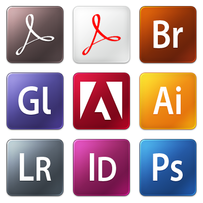
With Adobe’s new Creative Suite 3 icons receiving a less-than-warm reception in the blogosphere, a couple of designers have taken on the task of bringing them a different look. At the moment I’ve come across three great sets of icons to replace the basic CS3 ones, but there’s definitely more to come.
Check out Koregraphic, Louie Mantia and Adam Betts’ wonderful replacement sets.


In lieu of my recent post on Curing Designer’s Block, I thought I would share something that has been a wonderful source of inspiration for quite some time. An oft-neglected form of design that is (from personal experience) much more involved and difficult to master than any other field of design. Motion Graphics
Two-dimensional static design (such as that on the web or in print) is in itself a skill which requires much calculated thought, careful planning and a little bit of natural ability to truly master. Now, just think of the Motion Designers out there, who not only have to work with two and in many cases three dimensions, they also have to bring this design to life in a fourth dimension; time.
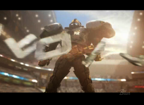
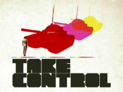
Some of the greats from this industry churn out beautiful works of art, that are truly captivating and generally inspiring in all walks of design. I have featured some of my favorite demo reels and clips below. I suggest that all designers look more into this industry, as it’s just a visually enthralling experience to witness some of the greater works.
Blur

exopolis

Hue

National Television

Pauloblob

Ságas

GUNSHOP

If you’re looking to find out more information on Motion Graphic Design, or just crave more cool clips, I suggest checking out the great Motion Graphics blog, Motionographer or xplsv.tv.
When designing for the Web, or for any environment for that matter, every designer gets stuck at one point or another. Many people simply scrap their progress and start from the beginning, but is this the best practice? Here are a few tips that have helped me get through some creative dry patches.
Sleep on it
One of the best things one can do to bring a fresh view to their stale design, is to sleep on it. Get a good nights sleep (a nap may also help), forget about your design woes and come back the next day to your work. This is probably the most effective means of rebuilding your inspiration.
Take a walk
Walking is a great way to clear your mind, and we could all use a little more exercise too 🙂 If you don’t like walking, then just get out of the house, go and get a coffee, take a stroll through the mall. Just get away from your computer.
Take a shower
If you’re on a tight deadline, then Designers block can be a serious issue. And it’s effects are compounded with the stress and pressures of meeting your oncoming deadline. Taking a nice hot shower will cleanse your mind (and your body for that matter), and help you to relax. This has been a great help for me in some cases.
Do something else
Go and watch a movie, read the newspaper, hit up your Xbox 360, whatever you enjoy doing. These things are great helps in getting your mind under control, as long as you don’t get carried away and spend all day on them!
If you do ever run into Designers block, then be sure not simply scrap your work. Once you look upon your progress with fresh eyes and a clear mind, then your inspiration should come flooding back.
I’m a huge advocate of displaying the “Time since this was posted” for your blogs posts. On the internet, our blog audience varies from people halfway across town to strangers from halfway across the planet, all of which live by differing timezones.
Displaying the time since each blog post was made can enforce to your readers that you maintain an active blog, and provides a simple way of letting visitors know how “fresh” each post is. And with the United States using a different date format to the rest of the world, keeping track of this becomes less trivial than it should be. Plus, reading “This post was made 2 hours and 5 minutes ago” is so much more “human friendly” than “Posted 02/12/2007 at 06:30 PM”
Standard date formats are just so 1995.
If you’re running WordPress, there’s a great (in terms of, it does it’s task simply and surely) plugin called Time Since (published and popularized by the well-known Binary Bonsai, that does the trick for me. It simple terms, it subtracts the post’s date/time from the current server date/time, and outputs it in a human-readable format.
Why Safari over Firefox?
I have always been a devout fan of Firefox, and it has many excellent features that make it a wonderful browser, and I love supporting open source projects, however, recently I begun to fall back on Safari as my browser of choice for daily browsing. There are a number of reasons why I did this, and I will do my best to explain myself in the following paragraphs.
Reason 1: Fonts
Firefox’s font rendering and anti-aliasing capabilities are far surpassed by that of Safari.app, I am not sure as to the reason why this is, but Firefox seems to not render fonts in the same way that the OS X GUI does, and thus the overall smoothness of type in Firefox is clearly sub par when comparing with the native OS X look. The crisp and smooth look of OS X’s font rendering was a major reason that I switched from Windows to Mac, and Firefox detracts from this experience.
Reason 2: Search Bar
This may seem like a minor thing to many people, but I can’t stand not having the little “x” in the search box in the top right of Firefox (clearing the input from the box). It takes way too much time to use the keyboard to delete the text in there after a search has been completed. On top of this, Safari also automatically clears it for you when a new tab is opened. Allowing you to quickly fire off another Google search, without hassle
Reason 3: Forms
Many people have attacked Safari for being quite restrictive when it comes to styling forms within web pages, form elements cannot be styled with CSS like any other standard page element, they are fixed to the “OS X” style. Many people find this irritating, however I quite like the look, especially when compared to Firefox’s “Windows Default Gray” feel.
Reason 4: Speed
When I was using Firefox as my everyday browser, I had it loaded with 5 or 6 different extensions, which began to seriously impact the browsers performance. Memory leaks were frequent, and the thing was just generally slow.
Reason 5: Aesthetics
To me (I’m running Uno to eliminate the tacky “brushed metal”) Safari just looks better. No unnecessary buttons, clear and clean design.
Reason 6: Download Icons
One really neat “feature” of Safari is that when you download a file, it’s icon actually has an updating progress bar on it. This means when you download multiple files simultaneously, you can easily track their progress simply by glancing at the desktop. This simply removes the necessity for a “downloads” window that only adds to screen clutter.
All that said, there are a few things that Firefox can do that Safari just can’t, and I still use Firefox and it’s wonderful Firebug and Web Developer plugins to test and debug websites. A flexible plugin engine would be really cool for Safari, however I don’t see this happening in the near future.
If any of you think I’m out of my mind for not using Firefox, or can suggest any ways to improve my Firefox experience, let me know.
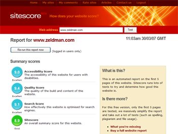
Silktide‘s well known Sitescore version 2 has recently been exhibited as an invite-only beta.
The online tool is used to analyze and score websites from a host of different methods, and is an invaluable tool for examining usability and SEO status.
Along with a brand new and down-right sexy design facelift, the behind the scenes score generating process has undergone some major changes, and according to Silktide, will now be more accurate and balanced.
Unfortunately I haven’t had the chance to try it out, although I am thoroughly looking forward to it’s open release in the very near future.
Check it out at Sitescore.org

(Image courtesy of sitescore.org)

