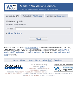
The Word Wide Web Consortium (the folks defining and promoting Web Standards) have recently given the ever-useful Markup Validator a discreet and well-executed styling. When such a redesign is being developed it’s important to focus on usability, readability and ease of use, graphical “design” should not detract from these basic elements of layout, but rather enhance them.

If you’re curious, take a look at the new design in action. I’m a huge fan of the “soft” look, usable layout and great choice of colour. It’s simple, and that’s all it needs to be.
When designing for the Web, one must be constantly mindful of the wide variety of Operating System/Browser combinations that are possible, and the varying results in rendering when it comes to these. If you’re a Mac user, you may find it difficult to debug your pages in Internet Explorer without having access to a Windows PC. Luckily, due to the recent move to Intel processors, Mac’s now have a whole bunch of different software solutions for Windows Virtualization, and recent improvements in this field offer even more seamless integration with OS X than ever before. One of the most popular applications for Windows Virtualization on the Mac is Crossover, which is based on WINE. While the premise of this app is great, it simply isn’t stable or reliable enough for repeated use.

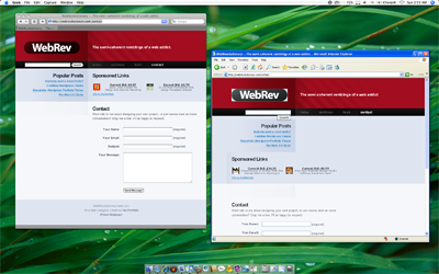
VMware Fusion has my support as the best Virtualization solution. You choose to either boot up a fully-fledged Windows XP or Vista installation, or just open single applications from the OS. The Windows applications are “unified” with OS X, and are displayed as standard independent windows within the Mac OS. For example, I’ve added icons for Internet Explorer 6 and 7 (both Vista and XP versions) in my Dock, clicking these opens the apps in their own windows, seemingly absent from Windows XP/Vista.
Sure, it’s probably not worth throwing out your XP/Vista test box just yet, but if OS X is your only available system, then this certainly will allow for some comprehensive testing across multiple platforms.
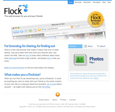
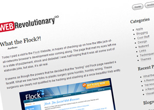
Today I paid a visit to the Flock Website, in hopes of checking up on how the little jack-of-all-networks browser’s development was coming along. The page that met my eyes left me in a state of puzzlement, shock and disbelief. I was half hoping that it was all some sort of elaborate joke, but alas, it’s all real.
It seems as though the powers that be decided that the “boring” old Flock page needed a facelift. What we see here folks is plastic surgery gone horribly, horribly wrong. These surgeons are clearly not qualified to be hacking and slashing at a once-beautiful Web entity.

Thar she blows. The brand new Flock page. What a colossal disaster. And no, the extent of this apparent trainwreck isn’t just skin deep, oh no. The underlying markup looks like it was printed on A4 paper, shredded and pasted back together again.
To refresh our memories, here’s a screencap of the “old” Flock design. Skillfully hand-crafted by Bryan Veloso, it embodies the very essence of simplistic beauty. All that Flock stands… or stood for.

I, for one, have completely lost faith in the project. I was initially interested in seeing what kind of progress had been made with the browser, but now I just can’t bear to look at the thing.
Flock that!
An Update
After a lengthy conversation with Evan Hamilton, Flock’s Community Ambassador, I’ve made a discovery or two. It turns out that the new Flock design was actually contracted out to an external agency. Flock have since hired an in-house designer, who, according to Evan will be able to properly communicate their visual ambitions. Evan mentioned the difficulties that arise when contracting a design over a large geographical distance, and I fully understand.
I must say, I was very impressed with Evan’s response during our back-and-forth, he was wonderful to chat with, seemed to take notice of my criticism and suggestions, was not offended by this harsh article and just came across as genuine. Consider my faith in the Flock project restored.
The iPhone has received an unprecedented amount of buzz over it’s release. Never before have such a wide gamut of people been so excited over a single product’s release. I find it absolutely amazing. Apple deserves tremendous applause, if not just for being able to kick up such a storm.
In noticing this, I have began my latest little Web Endeavor, in building a site to provide Free iPhone Wallpaper, called 320by480.com. (You may have noticed the discreet little link in this blog’s footer while I was developing it.
The site is tied very closely with Flickr. If I want to add a wallpaper to the “Selected” list, I simply use Flickr Uploader. There’s also a loosely community-driven section of Wallpaper, which shows all the photo’s tagged with iphonewallpaper.
320by480 was mostly created as a learning experience for myself. I’ve never had the chance to indulge myself in the Flickr API, and only now do I realize it’s potential and ease of use.
There’s a great little OS X Application called Get Tube that has proved itself amazingly useful and simple in performing it’s task. Just copy and paste the URL of a YouTube video (it also supports a couple of other video sites) and Get Tube will automatically download and convert it to either an MP4 (MPEG 4 video) or MP3.
Even though it’s a great program, I’m not too fond of its icon. So, I’ve come up with a simple little replacement icon, to fully justify this great app’s place on my dock.

If you’re getting a little tired of the Get Tube icon, Download My Replacement. If you don’t have Get Tube, I highly recommend trying it out. (Note: It uses VLC for transcoding, so you need that too)
All too often during my hours of performing daily web tasks do I uncover great examples of anti-usability, but they’re usually not to the extent of what I’m about to show you.
One would imagine that such a large company as Vodafone, claiming to hold 200 million proportionate customers in 27 markets across 5 continents would at least provide a human-usable experience for a common user path. But alas, they seem to have failed… and not too gracefully.
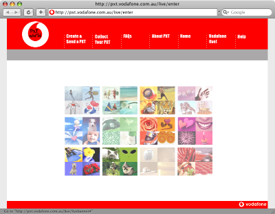
When I am sent a Picture Message (MMS) on my mobile phone, instead of receiving the image itself, I get a SMS message with a link to download my MMS from the Vodafone website. Now, as irritating as this is, this isn’t actually what my post is about. You see, apon visiting this URL in my web browser I am presented with the following.

When viewing the aforementioned page at full resolution, my focus is drawn to the absurd flash movie (which actually serves as a menu, unbeknownst to the user) rather than the navigation at the top of the page. After a couple of double-takes and head scratching, I (the average user) finally can avert my gaze from the pretty colours in the middle of screen and make use of the actual navigation bar to get that one step closer to my goal of collecting my “PXT”.
Upon further investigation, it turns out that the flash “thing” in the center is actually a navigation menu itself. But, the user can only find out this by hovering over each picture to see what link it holds. On top of that, not every picture is a link, and it feels like a “lucky draw” to get the one you want.

Due to the top menu utilizing some sort of whacky Javascript navigation technique, with scripts disabled it simply doesn’t work! Even though Javascript is quite commonly enabled for most users, there still are a number who either don’t use a browser that supports it, choose to disable it or have it disabled by their antivirus application. The only other navigational alternative to this is the little Flash movie, which also could be hidden to those users without the Flash Plugin.
So, a certain percentage of this page’s visitors won’t even be able to get to their destination, and even the ones that have all the plugins enabled will still spend more time than they should trying to figure out how to use the thing!
When I visit this page, I’m confused as to its purpose. I should be given exactly what I’m looking for, ready to be used. Instead I’m given this convoluted, confusing and unusable page.
In summary, if I were to be tasked to redesign/realign this page, I would probably do the following:
- Focus on the typical user path. Provide a clear focused link to “Collect your PXT”. As well as the other actions.
- Completely trash the pointless flash animation.
- Use a hover state on the navigation, to let the user know that it’s actually clickable.
- Use real links, rather than Javascript tomfoolery, to allow for direct linking to the proper page and accessibility for those with JS disabled.
- Ditch the annoying “TXT Speak” (“Collect yr PXT” – what a joke!). It’s insulting to the user’s intelligence.
- Instead of sending the user to a “splash page”, get them straight to the form they are looking for. The user shouldn’t have to jump through hoops to get their image
