Fantastic Collection of WordPress Themes & Website Templates

Apple Keyboard, Virtually Spill-resistant!

December 27th, 2007

Being a keyboard under my ownership is a stressful job. Due to my chosen profession, candidates need to endure not only the constant tapping of fingers, but the onslaught of occasional clumsy spillages. Be it from water, soft drink or more likely a large mug of coffee, it’s important that in such a stressful tim, my chosen keyboard has the stamina to emerge from liquid catastrophe.

I’ve been through countless generic Microsoft keyboards, one expensive Logitech Multimedia number and more recently, one of the “old” Apple Keyboards. Yes, just as I thought I’d found the perfect keyboard, the hefty white Apple Wireless KB succumbed to a drowning from a half-full cappuccino. After trying for quite some time to resuscitate it, yanking out all the keys and cleaning like a mad thing, it remains sticky and mostly unresponsive. To the trash with it.

New Apple Keyboard

But all is not lost, a little while ago I purchased the “new” Apple keyboard. Yes, the one that is about as thin as keyboards can get and about as beautiful too. Now, being used to plugging my fingers down on standard keyboards, I was worried that this new-fangled one would not have the necessary tact or the same feel as the keyboards I was used to. However after using it for a few months I’m absolutely in love with it, it feels great and has even survived an accident involving water, a pizza and a mug of coffee, and it’s still going strong. And that’s all I ask for in a keyboard. Kudos, Apple… Now just fix the darn scrollball in this wireless Mighty Mouse.

I Bought an iPod Classic

September 26th, 2007

So, based on a couple of days of intense inner debating, I decided to take the plunge, and get a Black 160GB iPod classic. It’s done, I’m happy. My logic was, why go for the fancy iPod touch, if I’m going to have to spend half the time sorting out which songs and videos I want to put on it, since I have much more than it’s limited capacity. I’d rather throw all my music on the classic and enjoy it 🙂

iPod

Strange Error in the Apple Store

September 10th, 2007

I paid a visit to the Australian Apple Store today, intent on buying a 160GB iPod Classic. Luckily I was halted, an given this conspicuous server error, else I would have rushed in and spent my money simply out of spite of the iPod Touch’s lacking in sufficient storage.

Apple Store Error

Oh Apple, How You Frustrate Me…

September 8th, 2007

So, as you probably are very well aware, Apple has recently updated its ever-popular iPod product line with brand new iterations of the “regular” iPod (now labeled iPod Classic) and Nano, as well as introducing the iPod Touch.

In the lead up to this announcement, I was excited to stipulate that Apple would be releasing a wide-screen, multi-touch version of their iPod, and I was correct in this assumption. However, I’m disappointed to learn that the Touch only sports up to 16GB of storage capacity.

Apple; I wanted an iPod with a big, beautiful screen to watch my movies in gorgeous detail, and you’ve done very well to provide this. But, I need enough damn space to store my relatively modest collection of videos and TV shows.

iPod Touch

16GB is not enough space for a device that is well suited for videos.

Ditch the slimmer, solid-state memory and throw in one of those 160GB disk drives that you seem to be using in the Classic. Then, and only then, I’ll relinquish my $400.

ColdBlue Updates, Milestones & New Things

August 7th, 2007

I’ve recently implemented a couple of updates to the ColdBlue WordPress Theme, which includes (finally) irradiating the annoying font size issues in IE, for good. Head over to the ColdBlue Page for more details and the download link. Upgrading is highly recommended, and is just a matter of overwriting your old theme files.

On a slightly related note, I’ve also written some guidelines for those of you who wish to share the theme with others. Many people have been uploading the zip file to their own web space and hosting it as such. While I do appreciate this venture, it does not allow me to track the number of downloads, nor ensure that only the very latest version is distributed. I would prefer a link to the ColdBlue page http://webrevolutionary.com/coldblue and/or a direct link to the latest file itself http://webrevolutionary.com/ColdBlue_latest.zip

Also, yesterday was a record-breaking day of traffic, with over 2,000 unique visitors laying eyes on this blog, which is even more visits than I received when ColdBlue was mentioned on Smashing Magazine and WP Designer.

I’m currently working on (amongst a mountain of other work) a brand new design for this blog, which is looking pretty cool so far. Once this is released, I’ll be wrapping up the current design as a free, publicly available theme.

More posts to come. Peace.

W3C Validator Redesigned

July 31st, 2007

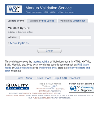
The Word Wide Web Consortium (the folks defining and promoting Web Standards) have recently given the ever-useful Markup Validator a discreet and well-executed styling. When such a redesign is being developed it’s important to focus on usability, readability and ease of use, graphical “design” should not detract from these basic elements of layout, but rather enhance them.

W3C Redesign

If you’re curious, take a look at the new design in action. I’m a huge fan of the “soft” look, usable layout and great choice of colour. It’s simple, and that’s all it needs to be.

Internet Explorer 6 and 7 in OS X

July 15th, 2007

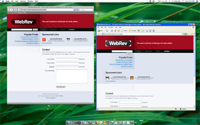
When designing for the Web, one must be constantly mindful of the wide variety of Operating System/Browser combinations that are possible, and the varying results in rendering when it comes to these. If you’re a Mac user, you may find it difficult to debug your pages in Internet Explorer without having access to a Windows PC. Luckily, due to the recent move to Intel processors, Mac’s now have a whole bunch of different software solutions for Windows Virtualization, and recent improvements in this field offer even more seamless integration with OS X than ever before. One of the most popular applications for Windows Virtualization on the Mac is Crossover, which is based on WINE. While the premise of this app is great, it simply isn’t stable or reliable enough for repeated use.

VMWare Fusion

VMware Fusion has my support as the best Virtualization solution. You choose to either boot up a fully-fledged Windows XP or Vista installation, or just open single applications from the OS. The Windows applications are “unified” with OS X, and are displayed as standard independent windows within the Mac OS. For example, I’ve added icons for Internet Explorer 6 and 7 (both Vista and XP versions) in my Dock, clicking these opens the apps in their own windows, seemingly absent from Windows XP/Vista.

Sure, it’s probably not worth throwing out your XP/Vista test box just yet, but if OS X is your only available system, then this certainly will allow for some comprehensive testing across multiple platforms.

What the Flock?!

July 12th, 2007

Today I paid a visit to the Flock Website, in hopes of checking up on how the little jack-of-all-networks browser’s development was coming along. The page that met my eyes left me in a state of puzzlement, shock and disbelief. I was half hoping that it was all some sort of elaborate joke, but alas, it’s all real.

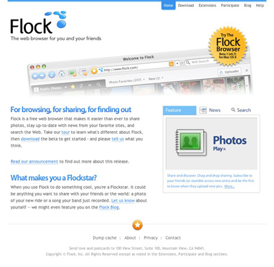
It seems as though the powers that be decided that the “boring” old Flock page needed a facelift. What we see here folks is plastic surgery gone horribly, horribly wrong. These surgeons are clearly not qualified to be hacking and slashing at a once-beautiful Web entity.

Flocking Ugly

Thar she blows. The brand new Flock page. What a colossal disaster. And no, the extent of this apparent trainwreck isn’t just skin deep, oh no. The underlying markup looks like it was printed on A4 paper, shredded and pasted back together again.

To refresh our memories, here’s a screencap of the “old” Flock design. Skillfully hand-crafted by Bryan Veloso, it embodies the very essence of simplistic beauty. All that Flock stands… or stood for.

Flock

I, for one, have completely lost faith in the project. I was initially interested in seeing what kind of progress had been made with the browser, but now I just can’t bear to look at the thing.

Flock that!

An Update

After a lengthy conversation with Evan Hamilton, Flock’s Community Ambassador, I’ve made a discovery or two. It turns out that the new Flock design was actually contracted out to an external agency. Flock have since hired an in-house designer, who, according to Evan will be able to properly communicate their visual ambitions. Evan mentioned the difficulties that arise when contracting a design over a large geographical distance, and I fully understand.

I must say, I was very impressed with Evan’s response during our back-and-forth, he was wonderful to chat with, seemed to take notice of my criticism and suggestions, was not offended by this harsh article and just came across as genuine. Consider my faith in the Flock project restored.

Free iPhone Wallpaper

July 9th, 2007

The iPhone has received an unprecedented amount of buzz over it’s release. Never before have such a wide gamut of people been so excited over a single product’s release. I find it absolutely amazing. Apple deserves tremendous applause, if not just for being able to kick up such a storm.

In noticing this, I have began my latest little Web Endeavor, in building a site to provide Free iPhone Wallpaper, called 320by480.com. (You may have noticed the discreet little link in this blog’s footer while I was developing it.

The site is tied very closely with Flickr. If I want to add a wallpaper to the “Selected” list, I simply use Flickr Uploader. There’s also a loosely community-driven section of Wallpaper, which shows all the photo’s tagged with iphonewallpaper.

320by480 was mostly created as a learning experience for myself. I’ve never had the chance to indulge myself in the Flickr API, and only now do I realize it’s potential and ease of use.

Get Tube Icon Replacement

July 2nd, 2007

There’s a great little OS X Application called Get Tube that has proved itself amazingly useful and simple in performing it’s task. Just copy and paste the URL of a YouTube video (it also supports a couple of other video sites) and Get Tube will automatically download and convert it to either an MP4 (MPEG 4 video) or MP3.

Even though it’s a great program, I’m not too fond of its icon. So, I’ve come up with a simple little replacement icon, to fully justify this great app’s place on my dock.

Get Tube Icon Replacement

If you’re getting a little tired of the Get Tube icon, Download My Replacement. If you don’t have Get Tube, I highly recommend trying it out. (Note: It uses VLC for transcoding, so you need that too)

Vodafone PXTworld: Anti-usability

July 1st, 2007

All too often during my hours of performing daily web tasks do I uncover great examples of anti-usability, but they’re usually not to the extent of what I’m about to show you.

One would imagine that such a large company as Vodafone, claiming to hold 200 million proportionate customers in 27 markets across 5 continents would at least provide a human-usable experience for a common user path. But alas, they seem to have failed… and not too gracefully.

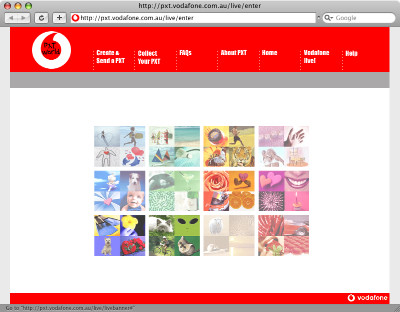
When I am sent a Picture Message (MMS) on my mobile phone, instead of receiving the image itself, I get a SMS message with a link to download my MMS from the Vodafone website. Now, as irritating as this is, this isn’t actually what my post is about. You see, apon visiting this URL in my web browser I am presented with the following.

Vodafone PXTworld

When viewing the aforementioned page at full resolution, my focus is drawn to the absurd flash movie (which actually serves as a menu, unbeknownst to the user) rather than the navigation at the top of the page. After a couple of double-takes and head scratching, I (the average user) finally can avert my gaze from the pretty colours in the middle of screen and make use of the actual navigation bar to get that one step closer to my goal of collecting my “PXT”.

Upon further investigation, it turns out that the flash “thing” in the center is actually a navigation menu itself. But, the user can only find out this by hovering over each picture to see what link it holds. On top of that, not every picture is a link, and it feels like a “lucky draw” to get the one you want.

Vodafone

Due to the top menu utilizing some sort of whacky Javascript navigation technique, with scripts disabled it simply doesn’t work! Even though Javascript is quite commonly enabled for most users, there still are a number who either don’t use a browser that supports it, choose to disable it or have it disabled by their antivirus application. The only other navigational alternative to this is the little Flash movie, which also could be hidden to those users without the Flash Plugin.

So, a certain percentage of this page’s visitors won’t even be able to get to their destination, and even the ones that have all the plugins enabled will still spend more time than they should trying to figure out how to use the thing!

When I visit this page, I’m confused as to its purpose. I should be given exactly what I’m looking for, ready to be used. Instead I’m given this convoluted, confusing and unusable page.

In summary, if I were to be tasked to redesign/realign this page, I would probably do the following:

  • Focus on the typical user path. Provide a clear focused link to “Collect your PXT”. As well as the other actions.
  • Completely trash the pointless flash animation.
  • Use a hover state on the navigation, to let the user know that it’s actually clickable.
  • Use real links, rather than Javascript tomfoolery, to allow for direct linking to the proper page and accessibility for those with JS disabled.
  • Ditch the annoying “TXT Speak” (“Collect yr PXT” – what a joke!). It’s insulting to the user’s intelligence.
  • Instead of sending the user to a “splash page”, get them straight to the form they are looking for. The user shouldn’t have to jump through hoops to get their image

The Easiest Way to…

June 27th, 2007

Copywriting is a part of creating a web page that seems even to be neglected by many of the the oh-so-2.0 type sites and services of the new millennium. How hard can it be to come up with a short string of original prose? Too hard, it would seem. I’ve done a quick Google search, uncovering the sheer extent and overuse of a certain cliché.

Floorplanner Tagline

Blinksale Tagline

Teamsnap Tagline

There really seems to be a surprisingly large number of websites that offer the “easiest way” of doing something… How odd.

WipBox: The easiest way to sell on eBay or Craigslist
Justgiving: The easiest way to fundraise and donate to charity online
Picture2Life: Easiest way to edit your pictures online
Sidewalk: The easiest way to gather and analyze customer information
BillQ: The easiest way to keep track of your bills.

Spend some time to think up an original tagline, it’s not rocket science. Please.

Why I Buy Mac Applications

June 18th, 2007

One thing that has changed about me over the year and a half since I switched to the Macintosh platform is that I’ve found a willingness to pay for Applications. All but abolishing my previous habit of pirating Windows software (admit it, we’d all rather fire up BitTorrent than hand over cash to Windows App Devs). This is a change that I had never expected, although it can surely be attributed to a few different factors.

The Software Just Works

When it comes to advertising an OS X application, the general mindset is as follows: Show them what our product does. If they like it, they’ll want it. Macintosh applications do exactly as they say on the box (or the website, as it were). Over at the Windows camp, many companies see advertising as: Make our product look as good as possible, even if it’s not. Which is a total drain on user confidence.

Mac Developers Are Likable

In order for me to be ready to fork over my hard-earned cash to a software developer, I have to truly feel confident about doing so. I actually want to support the creators of Mac applications, because they seem so genuine. In most cases, Mac Software is developed not by monolithic, research-toting, money hungry corporations, but rather a lone developer or tight-knit group of people who are passionate about their craft. I feel as if my spending is a contribution to the livelyhood of these people, instead of “just another sale” for the faceless corporation.

I Love the Macintosh Culture

Mac people are great people. Period. You can always count on an enthusiastic and open zealot to handle your support questions personally, and a wonderful community of like-thinkers. The Mac culture (you could nearly go as far as calling it a Philosophy) is one of warmth, confidence, welcoming and support. You simply can’t buy that kind of thing.

Sure, there are a number of great Windows Applications that transcend the image of their colleagues, but certainly not to the extent of frequency in the Macintosh world.

ColdBlue Theme V1.0.1

June 15th, 2007

Just a quick note; I’ve updated ColdBlue with a couple of fixes. If you’re using the theme I suggest you move to the new version.
Apologies for the frequency of posts about this one theme, I’ll resume my normal posting habits very soon.
Enjoy, and remember to let me know if you find any more bugs.

ColdBlue WordPress Theme

June 14th, 2007

ColdBlue is a WordPress Theme created to be aesthetically pleasing, open, minimalistic and easy to use. It is absolutely free to download, however if you enjoy the theme please be considerate and leave the link intact. This courtesy will go towards further development of ColdBlue and future themes (which will always be free).

Get Coldblue

Download ColdBlue 1.2

Update Log

  • 1.2.0 Modified: No longer using relative font sizes (Thanks For Web Designers)
  • 1.2.0 Fixed: IE font-size problems
  • 1.0.3 Fixed: “Bigger child” font-size issue. Only affected nested categories in sidebar.
  • 1.0.2 Modified: Screenshot and Theme directory name.
  • 1.0.1 Fixed: Internet Explorer 6 Font Size (Thanks Small Potato)
  • 1.0.1 Fixed: Nested pages breaking header (Thanks Small Potato)
  • 1.0.1 Fixed: Technorati “Add to your Favorites” link. en-us spelling and href.

Preview

ColdBlue WordPress Theme

Usage Notes

  • To align an image within a post to the left or right, give it a class of float-left or float-right respectively
  • Valid XHTML & and bugless in modern browsers
  • Subscribe to the RSS Feed to stay up to date with future releases and updates

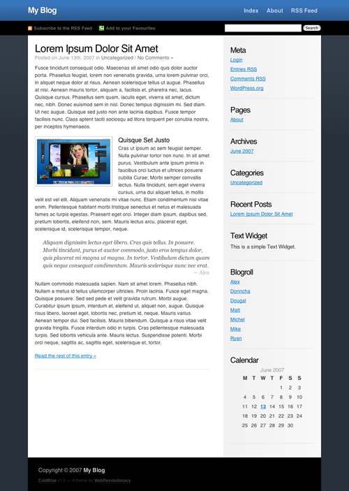
New WordPress Theme Preview

June 13th, 2007

Along with a brand new design for WebRevolutionary, I’m going to be releasing a new (free) publicly-available WordPress theme, which has yet to be named. Progress is coming along quite nicely, and I hope to have it released within the next week or so.

Wordpress Theme Preview

Features

  • Sidebar Widget Compatibility
  • Better readability (scalable fonts)
  • Syndication focus
  • Support for Ultimate Tag Warrior and other Plugins

I’m open for any suggestions, so if you’ve got an opinion or idea, let me know.

Reinvigorate Snoop

June 12th, 2007

The folks over at Reinvigorate have just pushed out an email announcing their latest endeavor.
Snoop is a downloadable application for Mac and Windows which keeps you updated on the latest user activity on your site (provided that you have an active Reinvigorate account). It features an live-updating list of recent visitors, and a really interesting method of tracking comments and even product purchases, which can be easily implemented with a little scripting knowledge.
Similar to the Mint Doorbell Pepper, Snoop features a variety of sound effects which alert you of either a new unique, returning or referred visitor, a product sale or a comment.

Snoop

This little application really has boosted my confidence in Reinvigorate, and I’m sure to be as addicted to it as I was to the Mint Doorbell Pepper, at least for a week or so… *ding* Oh vanity!

Convince Me to Use Twitter

June 10th, 2007

OK, so I may have been to quick to judge Twitter, having never actually used it to much extent (bar creating an account). So, I’m giving it another shot.

If you’ve got a Twitter account, add me, my username is stylereactor
Show me some neat things you can do with it, and help me convince myself that it’s useful. I’ll of course be announcing my mundane experience in timely Tweets, as that seems to be the norm. 🙂

The Keys to Web Success

June 4th, 2007

The Web is dominated by a handful of behemoth services, that manage to maintain their success as copy-cat products emerge and inevitably fall. This is due to one key factor (overriding anything else) that must be present with a new online product… Uniqueness.
It doesn’t come easy however, the path to a popular Web Application is a long, windy and sometimes frightening one, but with a proper attitude and some great ideas, you too can see your product thrive. Here are some tips that I’ve either picked up from personal experience, or observed from the activity of some of the more popular online successes.

1: Identify a gap in the market

YouTube was the first video sharing service that broke out into the mainstream market, and it has remained so over quite some time. Many company executives see this success as some sort of popularity raft they can float their own site on, and we now see countless similar sites attempting to chip away at YouTube’s market share. 99% of the time these attempts end in failure, and it’s due to one key factor; there is no room in the market. YouTube was built at a time where video sharing was simply not simple nor intuitive for the general public, and through perseverance (and a virally self-promoting social edge) they eventually filled the filled the gap and reaped the inherit success. There is very little chance that any other product (in the near future) will ever replace YouTube, because simply, our needs for this are fulfilled. Instead of focusing on jumping on the video bandwagon (or any other pre-existing market), you should strive to break into the *next* open market. Nobody will want to use your service if they can already do what they want somewhere else. Try and think about what services you would like to see, something that doesn’t yet exist. Innovate, don’t reciprocate. This is absolutely fundamental to any facet of business.

2: Know your user

You should build a service in which users can relate to, and thus, you must relate to your users. Be sure to have a good idea of a typical user in your mind, and try and adopt their mindset. This step will be quite difficult if you are detached from this group, so perhaps the best thing to do is to build a product that is close to your needs, the best services are the ones helmed by a passionate creator.

3: Build a service that works

On the Web, users want to do what they want in the fastest and easiest manner possible. Your service should be clear in what it provides, and it should provide this fast. Don’t make your users jump through hoops in order to complete their task, and make things logical. Think of what a typical user will want when visiting your site, and make the path to this as short as possible. Above all, your service should do what it is advertised to do, and well. There is nothing more frustrating for a user than a poorly-executed service that is confusing to use.

4: Stay dedicated

In short. Never give up. Don’t expect to be an overnight success, and be realistic about your goals. This doesn’t mean you should undervalue yourself, but the mindset of a hopeful overnight millionaire is a dangerous one, and one that rarely yields success. Stick by your product, and see it through. Who knows, you might just get there.

5: Gain trust through design

The design of your site is representative of your service, the typical user will subconsciously decide whether they like your site within a fraction of a second. Therefore, if users can’t relate to your design,they’ll see your product as inferior. What your design should aim to acheive is to influence this slit-second decision in the most positive manner. This is possibly the hardest nut to crack, as design is such a subjective topic. It goes hand in hand with knowing your user, and a skillful Designer or Usability expert should be able to achieve this. Be sure not to pass off design as an afterthought, as embracing a solid design is vital to making your users feel like using your product.

6: Promote… Carefully

Promotion is a massive topic in itself, but I’ll be as brief as I can. People will respond negatively if your product is blatantly promoted in a “cheap” manner. That is, be subtle with your promotion, as most people don’t like being bombarded with your product. The way I see it, is that you want users to want to use your product, steer well clear of forcing people into your site. You cant just squeeze money from your visitors, it must come naturally.

7: Make money without them knowing

Perhaps the most ideal way of monetizing a service, is to make money from your users without them even knowing about it. Your service can turn around some serious dough and still have your visitors using a free service, which is a complete about-face on the traditional product model. The most popular means of this is contextual advertising, and it’s is to make your ads fit seamlessly with the content. After all, ads don’t have to be a pain to view (like those stupid flashing banners of the 90s), and you can still make a buck or two.

So, if you have a good, working product that’s well promoted, solidly designed and has a sure-fire monetization strategy, you’re well on your way to success.

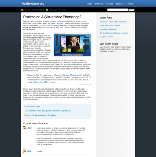
Pixelmator: A Slicker Mac Photoshop

June 3rd, 2007

There’s a very promising little app currently being developed by two young brothers which I am really excited about. It’s called Pixelmator, and from the limited information that can be obtained as yet (it’s still not publicly available), it appears to be an OS X-native Photoshop rival, sporting a super slick dark GUI and a slew of Photoshop-esque features.
Pixelmator

Supported by the open source libraries of ImageMagick, and a skillfully crafted design, I’m beginning to wonder whether this application will be an inexpensive (perhaps free?) alternative to the resource and dollar-hungry Photoshop CS3.

I, for one, will be faithfully awaiting a public beta.

Pixelmator Two

Free Themes

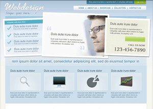
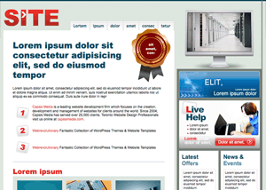
Web Services Template

This is a beautiful and clean Web Services / Business Template.

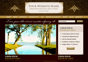
Photography Template

This is a beautiful and clean photography template.

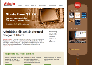
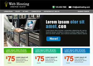
Hosting Business Template

This is a beautiful and clean Hosting/Business Template that can be used for companies who offer design related products or services to their customers.

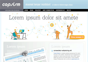
Business Web Template

This is a beautiful and clean Business Template that can be used for companies who offer design related products or services to their customers.

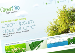
Green Design Template

This is a beautiful and clean Green Design Company Template that can be used for companies who offer design related products or services to their customers.

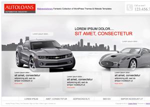
Auto Website Template

This is a beautiful and clean Auto Website Template that can be used for companies who offer design related products or services to their customers.

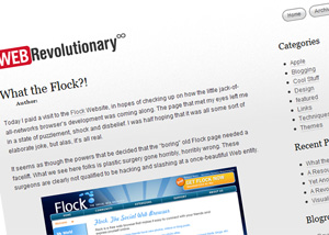
Revolutionary WordPress Theme

Clean and easy on eyes Wordpress theme, well structured, top quality coded with optional ad spots, fully widgetized and ready to go!!!

LightCSS WordPress Theme

Clean and easy on eyes theme, well structured, top quality coded with featured posts, ads spots, fully widgetized and ready to go!!!

ColdBlue Blogger Template

For those of you who love the simplicity of our popular ColdBlue Wordpress theme, but use Blogger as your blogging platform…you can now rejoice! The theme is now available!

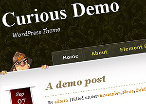
Curious WordPress Theme

Curious is released and developed free of charge and will be continually improved and updated.

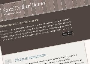
SandDollar WordPress Theme

SandDollar is released and developed free of charge and will be continually improved and updated...

ColdBlue WordPress Theme

ColdBlue is a WordPress Theme created to be aesthetically pleasing, open, minimalistic and easy to use.

Sharpfolio: WordPress Portfolio Theme

Sharpfolio is a WordPress theme designed to enable Web Designers, Graphic Designers, Photographers, Motion Designers, Artists or any creative professional....