I highly recommend checking out the beautiful new motion graphics showcase site, FWA Theater. It features some of the best and most inspiring work in advertising, viral video, motion and the like.

The site itself is powered by Fantasy Interactive‘s new platform, FiV, which seems to trump sites like YouTube in every way, and it’s pretty too.
I’ve been stunned by some of the design that’s being showcased using the brand new Sharpfolio theme, and today I’ve uncovered three wonderful designers who’ve chosen to use it to present their work to the world.
Tim May, Ryan Klaverweide (who found a use for white.css, which will be a part of future versions) and Ali Salem have made me very proud by choosing Sharpfolio to display their beautiful work.
Here’s a couple of my favourites. Click the images to view their full portfolios.


And just remember, you’re absolutely welcome to slice, dice, rip, tear and modify the Sharpfolio theme in any way, actually, I encourage it. Use it however you wish.
Leave me links in the comments here to show me your awesome work in Sharpfolio, or what you’ve done with it.
Most of the current publicized methods for implementing drop shadows in web design are far too excessive, some require wrapping the images in three extra divs, most rely on sliced images or sluggish javascript, but there’s a really simple method to add shadows to any block-level element without the need for any of this other faff, just pure, logical CSS.
As you’ll see in the examples, one can generate shadows of any width, in any colour and on any background. This technique is also rendered exactly the same in all browsers because, well, it’s just so simple (and simple solutions make me tingle).
Example: 2px Subtle Shadow

img.shadow {

	background: #afafaf;

	padding: 1px;

	border: 1px solid #d6d6d6;

}
Note that the above code is suited for this site’s background colour, I figuring out what colours to use before simply copying and pasting the code.
The logic behind this is quite simple, pad the element with 1 pixel of spacing to reveal its background colour (which is set to an appropriate shade of grey), then set the element’s border to a 1 pixel solid, lighter shade of grey. This gives a subtle (and in my opinion, good-looking) shadow effect, and won’t give you any headaches in the long run. I recommend using Photoshop to create a 3 pixel drop shadow on a layer (using your site’s background colour as the document background) and use this to reference your shadow colours.
If you’d like to see some more examples and take a look at the code, I’ve set up an Example Page. Using the methods documented there you can generate shadows of any size, even though I do believe the more subtle look is much nicer.
I’ve used this technique on a handful of client’s sites, even on dark backgrounds and it always works wonderfully, and since there’s no extra images, tricky javascript etc, you feel a lot cleaner when using this 🙂
As previously mentioned, I’ve just switched over to WebRevolutionary’s new design. While the old design was quite well received by most, I felt that it lacked the versatility I needed, had fairly poor typography, and, well, I was getting a little bored.
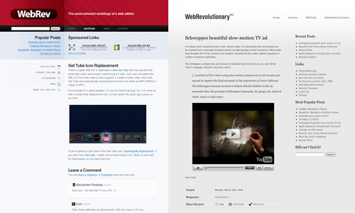
To some, the new design (unofficially named “Greyscale”) may not look quite as flashy, or as colourful as the previous incarnation, but that exactly what I was aiming for. The new theme is geared towards being clean, legible, well layed out, wider and more flexible. I enjoyed diving straight into the markup with this design, skipping the Photoshop mockup process entirely. This means that I was able to give more focus to the functionality and practicality of the blog, rather than it’s digs. I’m sure I’ll be tweaking this thing around for weeks, so if you find any gaping holes or oversights please get in touch with me.
In this new era for WebRevolutionary, I’m going to focus on making the posts colourful enough to balance out the… greyness of the layout, both in the literal and metaphorical sense.
As for the old red/black/blue theme, I’m about to start cleaning it up for public release. Either one individual who’s looking for a solid, unique theme for their blog, or, failing that a free download for the world to ingest. If you’d like to discuss the prospect of making the theme yours, again, just get in touch.
I’ve always been amazed by ultra-slow-motion video, it’s fascinating that such beauty can be revealed from seemingly mundane actions by looking deep at their transience. Who would have thought that I’d be staring at my monitor, mesmerized by a water balloon popping, or a piece of popcorn exploding.
The Schweppes company has just released a beautiful new television ad, as a part of the “Burst” campaign, filmed in Australia, which
[..] consists of five videos using slow motion cameras at 10,000 frames per second to capture the final moments in the trajectories of water balloons. The Schweppervescence moment is linked with the bubbles in the air moments after the pouring of Schweppes lemonade, dry ginger ale, mineral water, tonic or soda water.
Cool, huh?
The Word Wide Web Consortium (the folks defining and promoting Web Standards) have recently given the ever-useful Markup Validator a discreet and well-executed styling. When such a redesign is being developed it’s important to focus on usability, readability and ease of use, graphical “design” should not detract from these basic elements of layout, but rather enhance them.
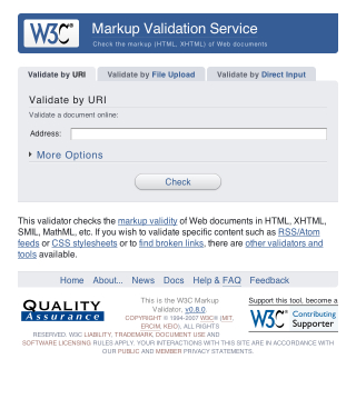
If you’re curious, take a look at the new design in action. I’m a huge fan of the “soft” look, usable layout and great choice of colour. It’s simple, and that’s all it needs to be.
Today I paid a visit to the Flock Website, in hopes of checking up on how the little jack-of-all-networks browser’s development was coming along. The page that met my eyes left me in a state of puzzlement, shock and disbelief. I was half hoping that it was all some sort of elaborate joke, but alas, it’s all real.
It seems as though the powers that be decided that the “boring” old Flock page needed a facelift. What we see here folks is plastic surgery gone horribly, horribly wrong. These surgeons are clearly not qualified to be hacking and slashing at a once-beautiful Web entity.

Thar she blows. The brand new Flock page. What a colossal disaster. And no, the extent of this apparent trainwreck isn’t just skin deep, oh no. The underlying markup looks like it was printed on A4 paper, shredded and pasted back together again.
To refresh our memories, here’s a screencap of the “old” Flock design. Skillfully hand-crafted by Bryan Veloso, it embodies the very essence of simplistic beauty. All that Flock stands… or stood for.
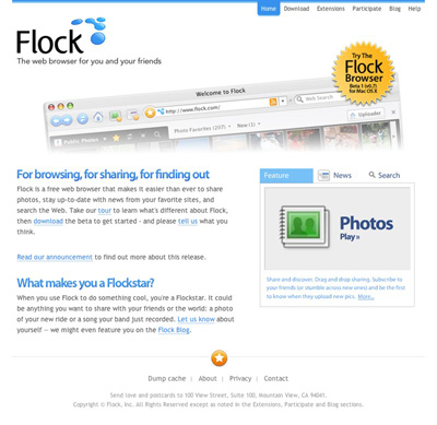
I, for one, have completely lost faith in the project. I was initially interested in seeing what kind of progress had been made with the browser, but now I just can’t bear to look at the thing.
Flock that!
An Update
After a lengthy conversation with Evan Hamilton, Flock’s Community Ambassador, I’ve made a discovery or two. It turns out that the new Flock design was actually contracted out to an external agency. Flock have since hired an in-house designer, who, according to Evan will be able to properly communicate their visual ambitions. Evan mentioned the difficulties that arise when contracting a design over a large geographical distance, and I fully understand.
I must say, I was very impressed with Evan’s response during our back-and-forth, he was wonderful to chat with, seemed to take notice of my criticism and suggestions, was not offended by this harsh article and just came across as genuine. Consider my faith in the Flock project restored.
The iPhone has received an unprecedented amount of buzz over it’s release. Never before have such a wide gamut of people been so excited over a single product’s release. I find it absolutely amazing. Apple deserves tremendous applause, if not just for being able to kick up such a storm.
In noticing this, I have began my latest little Web Endeavor, in building a site to provide Free iPhone Wallpaper, called 320by480.com. (You may have noticed the discreet little link in this blog’s footer while I was developing it.
The site is tied very closely with Flickr. If I want to add a wallpaper to the “Selected” list, I simply use Flickr Uploader. There’s also a loosely community-driven section of Wallpaper, which shows all the photo’s tagged with iphonewallpaper.
320by480 was mostly created as a learning experience for myself. I’ve never had the chance to indulge myself in the Flickr API, and only now do I realize it’s potential and ease of use.
There’s a great little OS X Application called Get Tube that has proved itself amazingly useful and simple in performing it’s task. Just copy and paste the URL of a YouTube video (it also supports a couple of other video sites) and Get Tube will automatically download and convert it to either an MP4 (MPEG 4 video) or MP3.
Even though it’s a great program, I’m not too fond of its icon. So, I’ve come up with a simple little replacement icon, to fully justify this great app’s place on my dock.
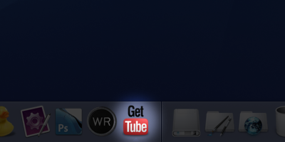
If you’re getting a little tired of the Get Tube icon, Download My Replacement. If you don’t have Get Tube, I highly recommend trying it out. (Note: It uses VLC for transcoding, so you need that too)
All too often during my hours of performing daily web tasks do I uncover great examples of anti-usability, but they’re usually not to the extent of what I’m about to show you.
One would imagine that such a large company as Vodafone, claiming to hold 200 million proportionate customers in 27 markets across 5 continents would at least provide a human-usable experience for a common user path. But alas, they seem to have failed… and not too gracefully.
When I am sent a Picture Message (MMS) on my mobile phone, instead of receiving the image itself, I get a SMS message with a link to download my MMS from the Vodafone website. Now, as irritating as this is, this isn’t actually what my post is about. You see, apon visiting this URL in my web browser I am presented with the following.
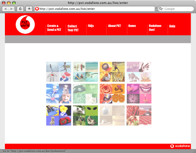
When viewing the aforementioned page at full resolution, my focus is drawn to the absurd flash movie (which actually serves as a menu, unbeknownst to the user) rather than the navigation at the top of the page. After a couple of double-takes and head scratching, I (the average user) finally can avert my gaze from the pretty colours in the middle of screen and make use of the actual navigation bar to get that one step closer to my goal of collecting my “PXT”.
Upon further investigation, it turns out that the flash “thing” in the center is actually a navigation menu itself. But, the user can only find out this by hovering over each picture to see what link it holds. On top of that, not every picture is a link, and it feels like a “lucky draw” to get the one you want.

Due to the top menu utilizing some sort of whacky Javascript navigation technique, with scripts disabled it simply doesn’t work! Even though Javascript is quite commonly enabled for most users, there still are a number who either don’t use a browser that supports it, choose to disable it or have it disabled by their antivirus application. The only other navigational alternative to this is the little Flash movie, which also could be hidden to those users without the Flash Plugin.
So, a certain percentage of this page’s visitors won’t even be able to get to their destination, and even the ones that have all the plugins enabled will still spend more time than they should trying to figure out how to use the thing!
When I visit this page, I’m confused as to its purpose. I should be given exactly what I’m looking for, ready to be used. Instead I’m given this convoluted, confusing and unusable page.
In summary, if I were to be tasked to redesign/realign this page, I would probably do the following:
- Focus on the typical user path. Provide a clear focused link to “Collect your PXT”. As well as the other actions.
- Completely trash the pointless flash animation.
- Use a hover state on the navigation, to let the user know that it’s actually clickable.
- Use real links, rather than Javascript tomfoolery, to allow for direct linking to the proper page and accessibility for those with JS disabled.
- Ditch the annoying “TXT Speak” (“Collect yr PXT” – what a joke!). It’s insulting to the user’s intelligence.
- Instead of sending the user to a “splash page”, get them straight to the form they are looking for. The user shouldn’t have to jump through hoops to get their image
The Web is dominated by a handful of behemoth services, that manage to maintain their success as copy-cat products emerge and inevitably fall. This is due to one key factor (overriding anything else) that must be present with a new online product… Uniqueness.
It doesn’t come easy however, the path to a popular Web Application is a long, windy and sometimes frightening one, but with a proper attitude and some great ideas, you too can see your product thrive. Here are some tips that I’ve either picked up from personal experience, or observed from the activity of some of the more popular online successes.
1: Identify a gap in the market
YouTube was the first video sharing service that broke out into the mainstream market, and it has remained so over quite some time. Many company executives see this success as some sort of popularity raft they can float their own site on, and we now see countless similar sites attempting to chip away at YouTube’s market share. 99% of the time these attempts end in failure, and it’s due to one key factor; there is no room in the market. YouTube was built at a time where video sharing was simply not simple nor intuitive for the general public, and through perseverance (and a virally self-promoting social edge) they eventually filled the filled the gap and reaped the inherit success. There is very little chance that any other product (in the near future) will ever replace YouTube, because simply, our needs for this are fulfilled. Instead of focusing on jumping on the video bandwagon (or any other pre-existing market), you should strive to break into the *next* open market. Nobody will want to use your service if they can already do what they want somewhere else. Try and think about what services you would like to see, something that doesn’t yet exist. Innovate, don’t reciprocate. This is absolutely fundamental to any facet of business.
2: Know your user
You should build a service in which users can relate to, and thus, you must relate to your users. Be sure to have a good idea of a typical user in your mind, and try and adopt their mindset. This step will be quite difficult if you are detached from this group, so perhaps the best thing to do is to build a product that is close to your needs, the best services are the ones helmed by a passionate creator.
3: Build a service that works
On the Web, users want to do what they want in the fastest and easiest manner possible. Your service should be clear in what it provides, and it should provide this fast. Don’t make your users jump through hoops in order to complete their task, and make things logical. Think of what a typical user will want when visiting your site, and make the path to this as short as possible. Above all, your service should do what it is advertised to do, and well. There is nothing more frustrating for a user than a poorly-executed service that is confusing to use.
4: Stay dedicated
In short. Never give up. Don’t expect to be an overnight success, and be realistic about your goals. This doesn’t mean you should undervalue yourself, but the mindset of a hopeful overnight millionaire is a dangerous one, and one that rarely yields success. Stick by your product, and see it through. Who knows, you might just get there.
5: Gain trust through design
The design of your site is representative of your service, the typical user will subconsciously decide whether they like your site within a fraction of a second. Therefore, if users can’t relate to your design,they’ll see your product as inferior. What your design should aim to acheive is to influence this slit-second decision in the most positive manner. This is possibly the hardest nut to crack, as design is such a subjective topic. It goes hand in hand with knowing your user, and a skillful Designer or Usability expert should be able to achieve this. Be sure not to pass off design as an afterthought, as embracing a solid design is vital to making your users feel like using your product.
6: Promote… Carefully
Promotion is a massive topic in itself, but I’ll be as brief as I can. People will respond negatively if your product is blatantly promoted in a “cheap” manner. That is, be subtle with your promotion, as most people don’t like being bombarded with your product. The way I see it, is that you want users to want to use your product, steer well clear of forcing people into your site. You cant just squeeze money from your visitors, it must come naturally.
7: Make money without them knowing
Perhaps the most ideal way of monetizing a service, is to make money from your users without them even knowing about it. Your service can turn around some serious dough and still have your visitors using a free service, which is a complete about-face on the traditional product model. The most popular means of this is contextual advertising, and it’s is to make your ads fit seamlessly with the content. After all, ads don’t have to be a pain to view (like those stupid flashing banners of the 90s), and you can still make a buck or two.
So, if you have a good, working product that’s well promoted, solidly designed and has a sure-fire monetization strategy, you’re well on your way to success.
I’ve never really been one to enjoy reading, at least analogue texts, but I just couldn’t resist the temptation to add a couple of Design Books to my underpopulated bookshelf. A couple of days ago I received a nice little package from Amazon.com, enclosed was the classic usability bible Don’t Make Me Think by Steve Krug, and Bulletproof Web Design by Dan Cederholm.
Both books are useful, if not at least interesting in their own right, however I simply can’t help but feel dissatisfied after reading (glancing) through each. Perhaps its just that I’m a practical learner, I require visual and interactive stimulation in order to get the ‘ole brain sparked up. Or perhaps I simply don’t have the patience required to sit down and read the things. Don’t get me wrong, I don’t have any issues with scholarship, I have do have a thirst for knowledge, but I doubt that traditional books will ever be able to quench this.
Trial and error, self teaching and internet browsing has taught me everything I know about the art and practice of Web Design… much more than studying any long-winded text ever could. I just don’t know…
Whoever said it was tough to find Web Design jobs? I’ve rounded up a list of 6 of the best online Job Boards for Web Design and other Digital Creative positions, freelance or permanent. Using this list (assuming you are skilled enough at your craft) you should have no excuse not to get out there and secure your next job!
Freelance Jobs – FreelanceSwitch
FreelanceSwitch has a wonderful Job Board, focused on Freelance positions.
Krop
Krop offers a great to-the-point list of “Creative & Tech Jobs”.
Jobs & Gigs
Jobs & Gigs uses the clever idea of separating “Jobs” (permanent employment) and “Gigs” (contract-based work) in a well-designed list.
Authentic Jobs
Cameron Moll brings you Authentic Jobs, a Design and Development Job Board that also features a great Dashboard Widget, and advertises positions for some high profile companies.
Coroflot
Corofloat‘s Job Board is very frequently updated and extensive.
Sitepoint “Looking to Hire”
If you’re getting really desperate, and don’t mind having the chance of doing underpaid amateur work, check out Sitepoint Looking to Hire
Traditionally, “Design”, including that of the Web variety has been taught in Schools and Universities as a strict and specific progress involving stages boiling down to (typically) 1: Planning – 2: Development – 3: Delivery, but is this really the most efficient way to work? Design is such a subjective field, but do the gung-ho tactics of many designers yeild the same results as those of designers who spend their time working in “pre-design”, carefully planning their next moves?
Let’s hear it from the pros
In preparation for this article, I have been attempting to contact some of the more well-known icons of the Web Design community, in order to find out exactly how they conduct things. The responses I received were quite varied, and a couple were pretty surprising.
So actually, I’m one of those guys that don’t do much paper sketches. Especially when it comes to UI design.
— Wolfgang Bartelme
Unfortunately I don’t know if I kept any of the drafts on designs I’ve completed.
— Christian Montoya
I do believe using paper is incredibly important, and I’m actually about to write up a post about some of my ideas that I’ve been using. I’m actually at the point where paper rivals the amount of design work I do with my computer. In fact, at this point, I might say that paper has over-taken my computer as my primary design tool of choice.
I’ll generally spend hours exploring and fleshing out ideas before I do anything at all on the computer. Then, depending on the project and my responsibilities for that project, I’ll turn the paper version into either wireframes, a comp, or even working code.I’ve found the use of paper to be a far superior way to come up with solutions. It’s much less focused on constraints and allows me to be significantly more creative.
— Garrett Dimon
Unfortunately, I’m not a sketcher. I sometimes do little doodles when coming up with ideas for logos but I tend to play in Fireworks more than hand draw.
— Jonathan Snook
And the community response?
I also made a few posts on a couple of Web Design-related forums, namely Mint Pages and my.9rules notes, the replies were not in vast quantity, but at least the responses can be used as a probe into the Design community’s general consensus.
Sometimes I get a design instantly, or just open photoshop to “doodle” and *bam* it’s there. Other times, it takes a couple of weeks to brew (if I have the time) in my mind, then countless tiny sketches and perhaps a couple of large (a4-filling) sketches or worked-out drawings, and then I bring it to photoshop. I do both ways varying on the time and place.
— Kilian
I actually don’t like to sketch, it distracts me. I tend to zone out and let the idea process “sketch it out” in my head.
My Design teachers HATED this and tried to dock me points on projects for lack of “brainstorming” but the dean wouldn’t let them as my end results were on par or better than those who HAD sketched.
— RightOn
I’m a real hands-on/visual person, so seeing things befone-hand is important to me, however, I often have a hard time putting my ideas on paper. So I’ll often start sketching out (sometimes just outlining) the project/idea, then finish I’ll it off in my head.
Though, add in the fact that I’m horribly forgetful, and then you can have quite a mess…so even though it can be a hassle for me to write stuff down and sketch it all out beforehand, I usually find that my projects turn out much better once I’ve brought them down to earth enough to have them written out on paper.
— momentography
The word “design” says it all. You’re not a designer unless you create a project and follow the steps necessary to render it properly. I usually go through a stabilished set of steps – sketch, test, render, test, deliver.
— FernandoLins
Apparently I am the oddball…I don’t sketch anything…I head straight for Photoshop to begin my mockups.
I, unfortunately, have very little talent for drawing, so sketching isn’t much help unless I am away from a computer and trying to describe the design to someone. I am not saying I have NEVER sketched, just that it isn’t in my standard process.
— creativeUI
Is the design process dead?
I was absolutely shocked to find out that most of the “top” Designers I queried revealed that they did very little to no on-paper planning before jumping into a design. I might add that I myself have been a proponent for “gung-ho” design tactics, and frequently work of bursts of inspiration rather than carefully planned work but I always assumed that this method was frowned upon among the community, I thought that I would be better off with sticking to the tried and tested generic design process… perhaps I was mistaken?
Each to his own
The answer to the question of “which is better?” is anything but clear-cut, and I can only respond by pointing out that everybody eventually discovers what “works” for them, people, by nature, simply think in different ways, some (mainly those who are more creatively-inclined) are motivated by their inspiration, others (primarily the more academically-minded) rely on a structured and careful approach, and you know what… as long as the client (or the Designer themselves) is happy, we need not worry ourselves about the process itself.
I can only wish that the results of this article were a little more definitive, but in an industry as subjective as the one we work in, no methods can truly be labeled as optimal. I recommend trying your hand at working from each approach in turn, and you will soon discover which one you are more comfortable with. Even if you have been a life-time subscriber to one school of thought, only good things can come from investigating other means of production.
I was recently browsing through the my.9rules notes, and I stumbled across a post penned by a ‘ruler who was irritated by applications that have their own non-standard GUI (think Windows Live Messenger). I realized that it was something that has been irritating me for so long.
If you”re not quite sure what I”m on about, here are a couple of screenshots of the worst (Windows) perpetrators. From top to bottom: Xfire, Steam, Windows Live Messenger (previously MSN Messenger), Ad-Aware and AIM Triton.
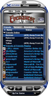
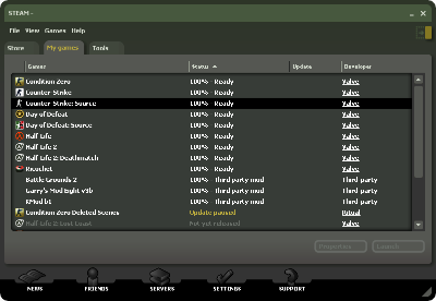
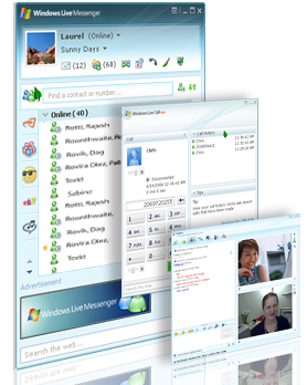
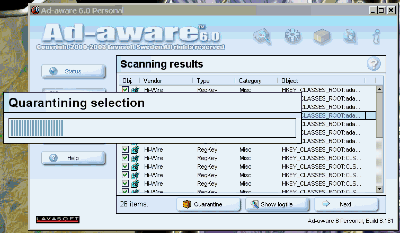
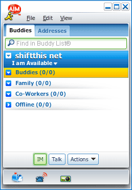
I hate having my OS”s GUI broken up by non-standard graphical layouts. Since when was the standard GUI inadequate even for Microsoft”s own applications?! Speaking of counter-usibility, Windows Live Messenger would have to be one of the most un-accessible applications I”ve ever had the misfortune to use, and now that MS has slowly phased in a “Vista” aesthetic, it sticks out like a sore (and ugly) thumb on my XP Desktop. I”m definitely in no hurry to upgrade to Vista, I had a short experience with it, but uninstalled it within a week due to it”s incompatibilities, terrible look and a slew of other issues. I”m just glad I have my trusty Mac here to serve as my main computer, and I”m thankful that I don”t have to use XP/Windows on a daily basis.
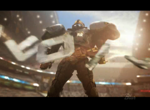
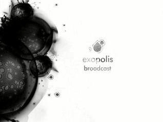
In lieu of my recent post on Curing Designer’s Block, I thought I would share something that has been a wonderful source of inspiration for quite some time. An oft-neglected form of design that is (from personal experience) much more involved and difficult to master than any other field of design. Motion Graphics
Two-dimensional static design (such as that on the web or in print) is in itself a skill which requires much calculated thought, careful planning and a little bit of natural ability to truly master. Now, just think of the Motion Designers out there, who not only have to work with two and in many cases three dimensions, they also have to bring this design to life in a fourth dimension; time.
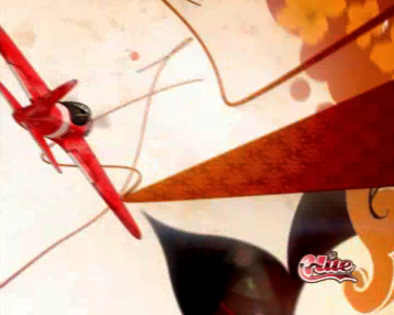
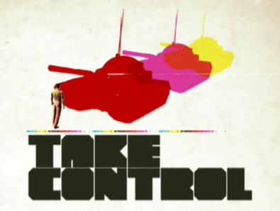
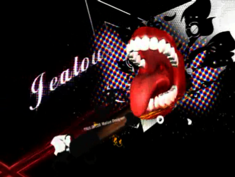
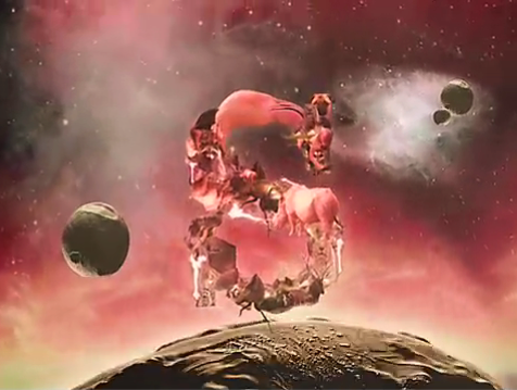
Some of the greats from this industry churn out beautiful works of art, that are truly captivating and generally inspiring in all walks of design. I have featured some of my favorite demo reels and clips below. I suggest that all designers look more into this industry, as it’s just a visually enthralling experience to witness some of the greater works.
Blur
exopolis
Hue
National Television
Pauloblob
Ságas
GUNSHOP
If you’re looking to find out more information on Motion Graphic Design, or just crave more cool clips, I suggest checking out the great Motion Graphics blog, Motionographer or xplsv.tv.
When designing for the Web, or for any environment for that matter, every designer gets stuck at one point or another. Many people simply scrap their progress and start from the beginning, but is this the best practice? Here are a few tips that have helped me get through some creative dry patches.
Sleep on it
One of the best things one can do to bring a fresh view to their stale design, is to sleep on it. Get a good nights sleep (a nap may also help), forget about your design woes and come back the next day to your work. This is probably the most effective means of rebuilding your inspiration.
Take a walk
Walking is a great way to clear your mind, and we could all use a little more exercise too 🙂 If you don’t like walking, then just get out of the house, go and get a coffee, take a stroll through the mall. Just get away from your computer.
Take a shower
If you’re on a tight deadline, then Designers block can be a serious issue. And it’s effects are compounded with the stress and pressures of meeting your oncoming deadline. Taking a nice hot shower will cleanse your mind (and your body for that matter), and help you to relax. This has been a great help for me in some cases.
Do something else
Go and watch a movie, read the newspaper, hit up your Xbox 360, whatever you enjoy doing. These things are great helps in getting your mind under control, as long as you don’t get carried away and spend all day on them!
If you do ever run into Designers block, then be sure not simply scrap your work. Once you look upon your progress with fresh eyes and a clear mind, then your inspiration should come flooding back.
Silktide‘s well known Sitescore version 2 has recently been exhibited as an invite-only beta.
The online tool is used to analyze and score websites from a host of different methods, and is an invaluable tool for examining usability and SEO status.
Along with a brand new and down-right sexy design facelift, the behind the scenes score generating process has undergone some major changes, and according to Silktide, will now be more accurate and balanced.
Unfortunately I haven’t had the chance to try it out, although I am thoroughly looking forward to it’s open release in the very near future.
Check it out at Sitescore.org
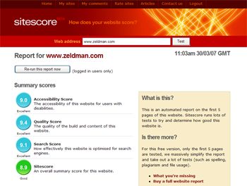
(Image courtesy of sitescore.org)
When it comes to podcasts that focus on the topics of Web Design and Development, we aren’t exactly spoiled for choice. However, there are a couple of great little ‘casts that I really enjoy. They are as follows.
If anybody else knows of other good design podcasts, be sure to let me know.
Live from the 101
Initially hosted by Brian Veloso (of Avalonstar fame), Live From the 101 is an excellent podcast, covering topics ranging from Dance Dance Revolution to the latest issues in the world of Web (surprisingly). Dan Rubin (Superfluous Banter) and Brian are joined by such guests as Cameron Moll, Steve Smith, Jonathan Snook and many other e-lebrities. I just loved the drunken SXSW coverage 🙂
Boagworld
Paul Boag and Marcus Lillington of Headscape (a UK-based Web Design firm) have created what has now become quite a well known and downright hilarious (at times) podcast, that just oozes delightful British wit. “For those involved in designing, developing and maintaining websites on a daily basis”. Boagworld was the first design podcast I found, and it’s got a permanent place in my iTunes syndication list.


