Apple’s minimalistic, aesthetic-focused product design philosophy seems to work very successfully in nearly every product they produce, bar one glaring exception; The Apple Mighty Mouse. For some reason, this product is, frankly, an ergonomic nightmare. Oddly, it seems to be shaped like some sort of alien pod from the future/space, not formed subtly to the natural flow of the human hand like you’d expect from a direct input device. This means that not only is it difficult to use (I sometimes find myself contorting my hand in wrist-tingling ways just to complete certain tasks as a part of my daily routine web-browsing and designing) but even more annoyingly, the pitifully tiny and strangely shaped scroll ball just stopped working for me a couple of weeks after purchase.
At first it wouldn’t scroll down, then upwards motions stopped registering and finally it just completely stopped responding. Upon checking the Apple support forums I discovered a huge number of folks with similar issues, and none with a working solution (at least, for me).

So, being completely fed up and ready to hurl this little smooth white hunk of useless shiny plastic through the wall, I ran out to a computer store and picked up the Logitech MX Revolution, having read such positive reviews for the thing by some respected bloggers (namely Glenn Wolsey).

And wow, what a difference! I honestly can’t believe I’ve been using anything else over the past years. This mouse feels absolutely comfortable to hold, and has more features than ever imaginable. I’ve now set it up to have complete control over my iTunes, I can increase/decrease volume, skip forwards and backwards between tracks, play and pause the current track and even hit the “quick search” button to bring up CoverSutra‘s awesome input box to skip to specific tracks by typing in keywords.
This is the best mouse I’ve ever held in my hand, and is in stark contrast with Apple’s rounded thing. If you’re considering a new mouse, then be sure to read more about the MX Revolution, and by god, think twice before grabbing the Mighty Mouse.
LiveSurface may look like a crisp set of stock images on the exterior, but it’s true purpose is to provide a way for designers to mock-up various treatments of their designs, in true-to-life 3D placement. If that all sounds too poorly worded to comprehend, take a second to watch the QuickTime video below.
A great method for presenting a “real-world” preview to your clients. Just throw the design into the LiveSurface composition and position it with Photoshop’s Vanishing Point filter (the three dimensional planes are already set up for you), and you’re good to go.
If you’d like to have a play with one of these ingenious images, create a free LiveSurface account and they’ll give you one for nothing, just for you to tinker with.
In my opinion, there are no mobile phones in the market today that deserve to be labeled an “iPhone Killer”, or even a rival to Apple’s holy device. However, that doesn’t mean to say that I think the iPhone is the best phone on the market, there just isn’t much yet that is geared the same way.

But there’s one device that is slated for release in the second half of 2008 that has really got me excited. The Sony Ericsson XPERIA X1 looks absolutely gorgeous, with an amazing 800 x 480 pixel resolution, 3 inch screen (compared to 320 x 480 pixel for the iPhone), supporting basically every network standard and a featuring full QWERTY slide-out keypad (along with full touch-screen capability). The software is based on Windows Mobile, but Sony Ericsson have put a huge focus on building the user interface, in an attempt to appeal to the iPhone generation. Coupled with full GPS functionality, Google Maps, WiFi, Video Calling, and a slew of other features, it really looks like the iPhone will have a worthy opponent later this year.

If you’re as enthused as I am about the upcoming release of this device, then I suggest subscribing to inexperia to stay as up to date as possible with the latest developments.
Being a keyboard under my ownership is a stressful job. Due to my chosen profession, candidates need to endure not only the constant tapping of fingers, but the onslaught of occasional clumsy spillages. Be it from water, soft drink or more likely a large mug of coffee, it’s important that in such a stressful tim, my chosen keyboard has the stamina to emerge from liquid catastrophe.
I’ve been through countless generic Microsoft keyboards, one expensive Logitech Multimedia number and more recently, one of the “old” Apple Keyboards. Yes, just as I thought I’d found the perfect keyboard, the hefty white Apple Wireless KB succumbed to a drowning from a half-full cappuccino. After trying for quite some time to resuscitate it, yanking out all the keys and cleaning like a mad thing, it remains sticky and mostly unresponsive. To the trash with it.
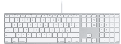
But all is not lost, a little while ago I purchased the “new” Apple keyboard. Yes, the one that is about as thin as keyboards can get and about as beautiful too. Now, being used to plugging my fingers down on standard keyboards, I was worried that this new-fangled one would not have the necessary tact or the same feel as the keyboards I was used to. However after using it for a few months I’m absolutely in love with it, it feels great and has even survived an accident involving water, a pizza and a mug of coffee, and it’s still going strong. And that’s all I ask for in a keyboard. Kudos, Apple… Now just fix the darn scrollball in this wireless Mighty Mouse.
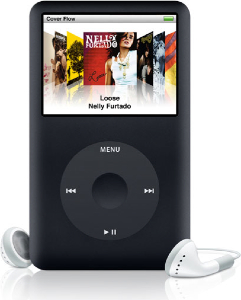
So, based on a couple of days of intense inner debating, I decided to take the plunge, and get a Black 160GB iPod classic. It’s done, I’m happy. My logic was, why go for the fancy iPod touch, if I’m going to have to spend half the time sorting out which songs and videos I want to put on it, since I have much more than it’s limited capacity. I’d rather throw all my music on the classic and enjoy it 🙂
All too often during my hours of performing daily web tasks do I uncover great examples of anti-usability, but they’re usually not to the extent of what I’m about to show you.
One would imagine that such a large company as Vodafone, claiming to hold 200 million proportionate customers in 27 markets across 5 continents would at least provide a human-usable experience for a common user path. But alas, they seem to have failed… and not too gracefully.
When I am sent a Picture Message (MMS) on my mobile phone, instead of receiving the image itself, I get a SMS message with a link to download my MMS from the Vodafone website. Now, as irritating as this is, this isn’t actually what my post is about. You see, apon visiting this URL in my web browser I am presented with the following.
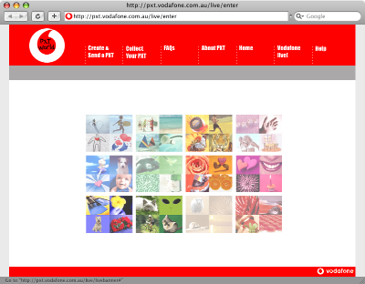
When viewing the aforementioned page at full resolution, my focus is drawn to the absurd flash movie (which actually serves as a menu, unbeknownst to the user) rather than the navigation at the top of the page. After a couple of double-takes and head scratching, I (the average user) finally can avert my gaze from the pretty colours in the middle of screen and make use of the actual navigation bar to get that one step closer to my goal of collecting my “PXT”.
Upon further investigation, it turns out that the flash “thing” in the center is actually a navigation menu itself. But, the user can only find out this by hovering over each picture to see what link it holds. On top of that, not every picture is a link, and it feels like a “lucky draw” to get the one you want.

Due to the top menu utilizing some sort of whacky Javascript navigation technique, with scripts disabled it simply doesn’t work! Even though Javascript is quite commonly enabled for most users, there still are a number who either don’t use a browser that supports it, choose to disable it or have it disabled by their antivirus application. The only other navigational alternative to this is the little Flash movie, which also could be hidden to those users without the Flash Plugin.
So, a certain percentage of this page’s visitors won’t even be able to get to their destination, and even the ones that have all the plugins enabled will still spend more time than they should trying to figure out how to use the thing!
When I visit this page, I’m confused as to its purpose. I should be given exactly what I’m looking for, ready to be used. Instead I’m given this convoluted, confusing and unusable page.
In summary, if I were to be tasked to redesign/realign this page, I would probably do the following:
- Focus on the typical user path. Provide a clear focused link to “Collect your PXT”. As well as the other actions.
- Completely trash the pointless flash animation.
- Use a hover state on the navigation, to let the user know that it’s actually clickable.
- Use real links, rather than Javascript tomfoolery, to allow for direct linking to the proper page and accessibility for those with JS disabled.
- Ditch the annoying “TXT Speak” (“Collect yr PXT” – what a joke!). It’s insulting to the user’s intelligence.
- Instead of sending the user to a “splash page”, get them straight to the form they are looking for. The user shouldn’t have to jump through hoops to get their image
The folks over at Reinvigorate have just pushed out an email announcing their latest endeavor.
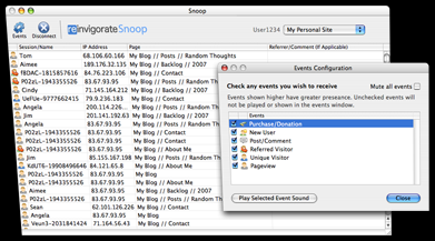
Snoop is a downloadable application for Mac and Windows which keeps you updated on the latest user activity on your site (provided that you have an active Reinvigorate account). It features an live-updating list of recent visitors, and a really interesting method of tracking comments and even product purchases, which can be easily implemented with a little scripting knowledge.
Similar to the Mint Doorbell Pepper, Snoop features a variety of sound effects which alert you of either a new unique, returning or referred visitor, a product sale or a comment.
This little application really has boosted my confidence in Reinvigorate, and I’m sure to be as addicted to it as I was to the Mint Doorbell Pepper, at least for a week or so… *ding* Oh vanity!
OK, so I may have been to quick to judge Twitter, having never actually used it to much extent (bar creating an account). So, I’m giving it another shot.
If you’ve got a Twitter account, add me, my username is stylereactor
Show me some neat things you can do with it, and help me convince myself that it’s useful. I’ll of course be announcing my mundane experience in timely Tweets, as that seems to be the norm. 🙂
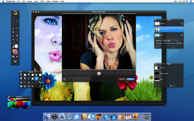
There’s a very promising little app currently being developed by two young brothers which I am really excited about. It’s called Pixelmator, and from the limited information that can be obtained as yet (it’s still not publicly available), it appears to be an OS X-native Photoshop rival, sporting a super slick dark GUI and a slew of Photoshop-esque features.
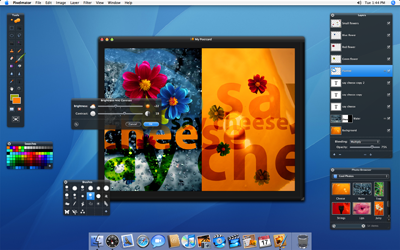
Supported by the open source libraries of ImageMagick, and a skillfully crafted design, I’m beginning to wonder whether this application will be an inexpensive (perhaps free?) alternative to the resource and dollar-hungry Photoshop CS3.
I, for one, will be faithfully awaiting a public beta.
I’ve never been one to shamelessly promote a specific product, but I found myself compelled to spread the word about a little productivity-boosting app called WriteRoom (excuse the horrific pun in this post’s title). Put simply, WriteRoom blocks you from all the flashing widgets, bouncing icons and pretty colours of the OS X interface and gives you a blank “typewriter-style” page, loyally waiting to take down your notes, or record your next blog post (such as I’m doing this very moment).
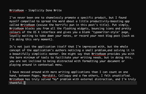
It’s not just the application itself that I’m impressed with, but the whole concept of the application’s authors noticing a small problem, and solving it in a beautifully simplistic manner. One might say that WriteRoom provides you with the bare minimum of tools to facilitate your writing needs, but in doing this, you are not inclined to being distracted with formatting your document or playing around in contextual menu.
I have messed around with more writing applications than I can count on one hand, between Pages, MarsEdit, Colloquy and a few others, I felt unsatisfied. WriteRoom has truly solved *my* problem with external distraction, and I’m truly thankful.
Note: If you’re a Windows user looking for a text-editor in the same vain as WriteRoom, check out its win32 cousin Dark Room.
I’ve been using Joost for a little while now and am convinced that it’s definitely going to be a big part of the future of internet TV.

Make a comment on this post with your email, and I’ll send you an Invite.
**UPDATE** – Invite closed.
I’ll be the first to admit it, I just find Twitter irritating. There’s just something in me that doesn’t make me interested in hearing the mundane information about people’s lives. Especially when it’s fired at you at the rate of “Tweets”. Sure, it’s a fine concept, and it’s obviously caught on with some degree of success, but I’m simply not interested in that sort of thing.
I must confess, I did make a Twitter account, just to try the thing out. It lasted for all of 10 minutes. I just don’t know if any good things can come from a community which is centered around “ping” type updates, of little value.
And speaking of the “new wave” community sites, Virb is not my cup of tea either. I’m already a part of Myspace (just for my “real life” friends. I do have some :)), many forums, Digg, YouTube and actively comment on as many blogs as I can, and I think that’s just about enough. These days there are just so many social networks and groups to be a part of, and Virb (to me) is just one too many.
When I begin to think more deeply about it, I struggle to find any advantageous purpose for these social-networky sites. Sure, it’s great to have connections, but between LinkedIn, Myspace, Virb and Twitter (just to name a few of the more popular ones), we are really overly spoiled for choice. One minute you just *have* to be a part of Myspace, then weeks later, your friends are asking you to join Virb, what’s next? Each new network seems to be “Newer, Cooler and Better!”. There really should be one, single, definitive network that connects everyone in a balanced and generic way. Not thousands of sub-par networks which are populated and deserted on a whim. Fads come and go way too quickly, so the internet may not be the place for making meaningful and lifetime connections.
Call me old fashioned, but I’ll stick to my real life social networks. Even if I don’t have 5,212 friends.
I’ve been an avid user of Shaun Inman’s Mint since a little while after it’s initial public release, and have been altogether pleased with it’s stat-tracking abilities and clean aesthetic.

But there’s a new kid on the block, and it’s been seducing me with an almost similar minty-green flair ever since I realized I still had a beta invite lying around. It’s called reinvigorate.
Being a hosted stats package, reinvigorate works in a slightly different manner to Mint, your stats are calculated and displayed on a remote server, which provides a great looking page filled with pretty pie charts, bar graphs and all the raw data to fuel blogger’s egomania. reinvigorate is currently free of charge, and with Mint priced at $30 per license, this may be it’s biggest advantage.
There’s no denying that both packages offer a beautiful interface, and both will be more than adequate for the average user’s needs, but my preference still lies with Mint. It’s level of customizability, plugin architecture and the fact that it’s hosted on my own server make it the most useful statistics package to date.
That said, I do prefer reinvigorate’s design to Mint’s, I just love the beautiful graphs and charts it renders, as well as the cool tabbed interface.
Today I unpacked my brand spankin’ new Dell 2407WFP Monitor, and I’m absolutely smitten with it. Moving from my relatively tiny 1440×900 MacBook Pro screen to this 16:10 widescreen beauty was a big step, but I now can’t figure out how I survived without it. Designing is so much easier when you have enough screen real estate to work with, and it makes multitasking so much smoother and more enjoyable.
Now I just need to upgrade my RAM to at least 1GB. With all these applications running, my poor old M-Book is getting a little hot under the collar!
Silktide‘s well known Sitescore version 2 has recently been exhibited as an invite-only beta.
The online tool is used to analyze and score websites from a host of different methods, and is an invaluable tool for examining usability and SEO status.
Along with a brand new and down-right sexy design facelift, the behind the scenes score generating process has undergone some major changes, and according to Silktide, will now be more accurate and balanced.
Unfortunately I haven’t had the chance to try it out, although I am thoroughly looking forward to it’s open release in the very near future.
Check it out at Sitescore.org
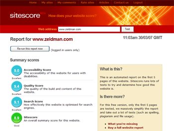
(Image courtesy of sitescore.org)
Inquisitor is a great little addon to Safari that adds an in-depth popup to the search box. It’s easily and quickly accessible with keyboard shortcuts, and now that I’ve finally tried it out, it’s proving to be much more than the gimmick I originally thought it to be.

It vaguely reminds me of CoverFlow (now a standard feature in iTunes, and soon to be on the iPod and iPhone), a fun little independantly-developed app that was scooped up by Apple and implemented into their products. I wonder if an Inquisitor-like feature would ever be included in Safari as standard…