The New Design
- Posted in Design
- Comments 0
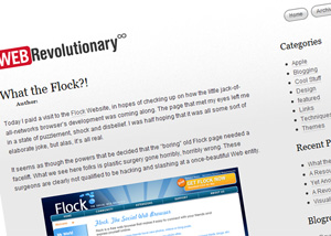
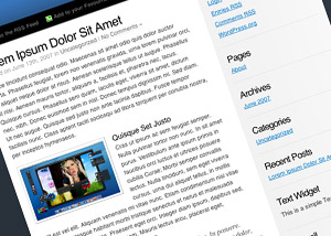
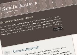
As previously mentioned, I’ve just switched over to WebRevolutionary’s new design. While the old design was quite well received by most, I felt that it lacked the versatility I needed, had fairly poor typography, and, well, I was getting a little bored.
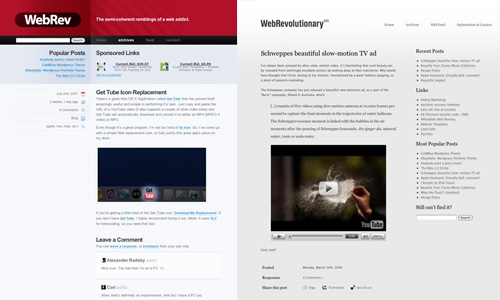
To some, the new design (unofficially named “Greyscale”) may not look quite as flashy, or as colourful as the previous incarnation, but that exactly what I was aiming for. The new theme is geared towards being clean, legible, well layed out, wider and more flexible. I enjoyed diving straight into the markup with this design, skipping the Photoshop mockup process entirely. This means that I was able to give more focus to the functionality and practicality of the blog, rather than it’s digs. I’m sure I’ll be tweaking this thing around for weeks, so if you find any gaping holes or oversights please get in touch with me.
In this new era for WebRevolutionary, I’m going to focus on making the posts colourful enough to balance out the… greyness of the layout, both in the literal and metaphorical sense.
As for the old red/black/blue theme, I’m about to start cleaning it up for public release. Either one individual who’s looking for a solid, unique theme for their blog, or, failing that a free download for the world to ingest. If you’d like to discuss the prospect of making the theme yours, again, just get in touch.


