W3C Validator Redesigned
- Posted in Blogging
- Comments 0
The Word Wide Web Consortium (the folks defining and promoting Web Standards) have recently given the ever-useful Markup Validator a discreet and well-executed styling. When such a redesign is being developed it’s important to focus on usability, readability and ease of use, graphical “design” should not detract from these basic elements of layout, but rather enhance them.
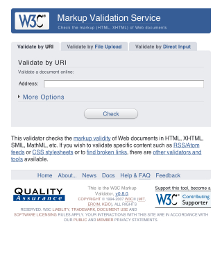
If you’re curious, take a look at the new design in action. I’m a huge fan of the “soft” look, usable layout and great choice of colour. It’s simple, and that’s all it needs to be.