Today I paid a visit to the Flock Website, in hopes of checking up on how the little jack-of-all-networks browser’s development was coming along. The page that met my eyes left me in a state of puzzlement, shock and disbelief. I was half hoping that it was all some sort of elaborate joke, but alas, it’s all real.
It seems as though the powers that be decided that the “boring” old Flock page needed a facelift. What we see here folks is plastic surgery gone horribly, horribly wrong. These surgeons are clearly not qualified to be hacking and slashing at a once-beautiful Web entity.

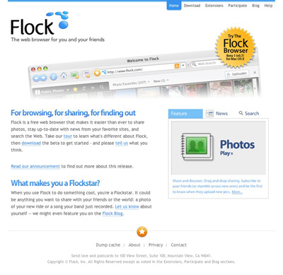
Thar she blows. The brand new Flock page. What a colossal disaster. And no, the extent of this apparent trainwreck isn’t just skin deep, oh no. The underlying markup looks like it was printed on A4 paper, shredded and pasted back together again.
To refresh our memories, here’s a screencap of the “old” Flock design. Skillfully hand-crafted by Bryan Veloso, it embodies the very essence of simplistic beauty. All that Flock stands… or stood for.
I, for one, have completely lost faith in the project. I was initially interested in seeing what kind of progress had been made with the browser, but now I just can’t bear to look at the thing.
Flock that!
An Update
After a lengthy conversation with Evan Hamilton, Flock’s Community Ambassador, I’ve made a discovery or two. It turns out that the new Flock design was actually contracted out to an external agency. Flock have since hired an in-house designer, who, according to Evan will be able to properly communicate their visual ambitions. Evan mentioned the difficulties that arise when contracting a design over a large geographical distance, and I fully understand.
I must say, I was very impressed with Evan’s response during our back-and-forth, he was wonderful to chat with, seemed to take notice of my criticism and suggestions, was not offended by this harsh article and just came across as genuine. Consider my faith in the Flock project restored.
Why Safari over Firefox?
I have always been a devout fan of Firefox, and it has many excellent features that make it a wonderful browser, and I love supporting open source projects, however, recently I begun to fall back on Safari as my browser of choice for daily browsing. There are a number of reasons why I did this, and I will do my best to explain myself in the following paragraphs.
Reason 1: Fonts
Firefox’s font rendering and anti-aliasing capabilities are far surpassed by that of Safari.app, I am not sure as to the reason why this is, but Firefox seems to not render fonts in the same way that the OS X GUI does, and thus the overall smoothness of type in Firefox is clearly sub par when comparing with the native OS X look. The crisp and smooth look of OS X’s font rendering was a major reason that I switched from Windows to Mac, and Firefox detracts from this experience.
Reason 2: Search Bar
This may seem like a minor thing to many people, but I can’t stand not having the little “x” in the search box in the top right of Firefox (clearing the input from the box). It takes way too much time to use the keyboard to delete the text in there after a search has been completed. On top of this, Safari also automatically clears it for you when a new tab is opened. Allowing you to quickly fire off another Google search, without hassle
Reason 3: Forms
Many people have attacked Safari for being quite restrictive when it comes to styling forms within web pages, form elements cannot be styled with CSS like any other standard page element, they are fixed to the “OS X” style. Many people find this irritating, however I quite like the look, especially when compared to Firefox’s “Windows Default Gray” feel.
Reason 4: Speed
When I was using Firefox as my everyday browser, I had it loaded with 5 or 6 different extensions, which began to seriously impact the browsers performance. Memory leaks were frequent, and the thing was just generally slow.
Reason 5: Aesthetics
To me (I’m running Uno to eliminate the tacky “brushed metal”) Safari just looks better. No unnecessary buttons, clear and clean design.
Reason 6: Download Icons
One really neat “feature” of Safari is that when you download a file, it’s icon actually has an updating progress bar on it. This means when you download multiple files simultaneously, you can easily track their progress simply by glancing at the desktop. This simply removes the necessity for a “downloads” window that only adds to screen clutter.
All that said, there are a few things that Firefox can do that Safari just can’t, and I still use Firefox and it’s wonderful Firebug and Web Developer plugins to test and debug websites. A flexible plugin engine would be really cool for Safari, however I don’t see this happening in the near future.
If any of you think I’m out of my mind for not using Firefox, or can suggest any ways to improve my Firefox experience, let me know.