Vodafone PXTworld: Anti-usability
- Posted in Blogging
- Comments 0
All too often during my hours of performing daily web tasks do I uncover great examples of anti-usability, but they’re usually not to the extent of what I’m about to show you.
One would imagine that such a large company as Vodafone, claiming to hold 200 million proportionate customers in 27 markets across 5 continents would at least provide a human-usable experience for a common user path. But alas, they seem to have failed… and not too gracefully.
When I am sent a Picture Message (MMS) on my mobile phone, instead of receiving the image itself, I get a SMS message with a link to download my MMS from the Vodafone website. Now, as irritating as this is, this isn’t actually what my post is about. You see, apon visiting this URL in my web browser I am presented with the following.
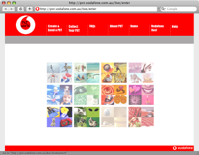
When viewing the aforementioned page at full resolution, my focus is drawn to the absurd flash movie (which actually serves as a menu, unbeknownst to the user) rather than the navigation at the top of the page. After a couple of double-takes and head scratching, I (the average user) finally can avert my gaze from the pretty colours in the middle of screen and make use of the actual navigation bar to get that one step closer to my goal of collecting my “PXT”.
Upon further investigation, it turns out that the flash “thing” in the center is actually a navigation menu itself. But, the user can only find out this by hovering over each picture to see what link it holds. On top of that, not every picture is a link, and it feels like a “lucky draw” to get the one you want.

Due to the top menu utilizing some sort of whacky Javascript navigation technique, with scripts disabled it simply doesn’t work! Even though Javascript is quite commonly enabled for most users, there still are a number who either don’t use a browser that supports it, choose to disable it or have it disabled by their antivirus application. The only other navigational alternative to this is the little Flash movie, which also could be hidden to those users without the Flash Plugin.
So, a certain percentage of this page’s visitors won’t even be able to get to their destination, and even the ones that have all the plugins enabled will still spend more time than they should trying to figure out how to use the thing!
When I visit this page, I’m confused as to its purpose. I should be given exactly what I’m looking for, ready to be used. Instead I’m given this convoluted, confusing and unusable page.
In summary, if I were to be tasked to redesign/realign this page, I would probably do the following:
- Focus on the typical user path. Provide a clear focused link to “Collect your PXT”. As well as the other actions.
- Completely trash the pointless flash animation.
- Use a hover state on the navigation, to let the user know that it’s actually clickable.
- Use real links, rather than Javascript tomfoolery, to allow for direct linking to the proper page and accessibility for those with JS disabled.
- Ditch the annoying “TXT Speak” (“Collect yr PXT” – what a joke!). It’s insulting to the user’s intelligence.
- Instead of sending the user to a “splash page”, get them straight to the form they are looking for. The user shouldn’t have to jump through hoops to get their image