The Word Wide Web Consortium (the folks defining and promoting Web Standards) have recently given the ever-useful Markup Validator a discreet and well-executed styling. When such a redesign is being developed it’s important to focus on usability, readability and ease of use, graphical “design” should not detract from these basic elements of layout, but rather enhance them.
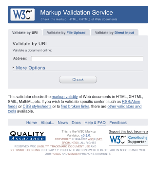
If you’re curious, take a look at the new design in action. I’m a huge fan of the “soft” look, usable layout and great choice of colour. It’s simple, and that’s all it needs to be.
Today I paid a visit to the Flock Website, in hopes of checking up on how the little jack-of-all-networks browser’s development was coming along. The page that met my eyes left me in a state of puzzlement, shock and disbelief. I was half hoping that it was all some sort of elaborate joke, but alas, it’s all real.
It seems as though the powers that be decided that the “boring” old Flock page needed a facelift. What we see here folks is plastic surgery gone horribly, horribly wrong. These surgeons are clearly not qualified to be hacking and slashing at a once-beautiful Web entity.

Thar she blows. The brand new Flock page. What a colossal disaster. And no, the extent of this apparent trainwreck isn’t just skin deep, oh no. The underlying markup looks like it was printed on A4 paper, shredded and pasted back together again.
To refresh our memories, here’s a screencap of the “old” Flock design. Skillfully hand-crafted by Bryan Veloso, it embodies the very essence of simplistic beauty. All that Flock stands… or stood for.
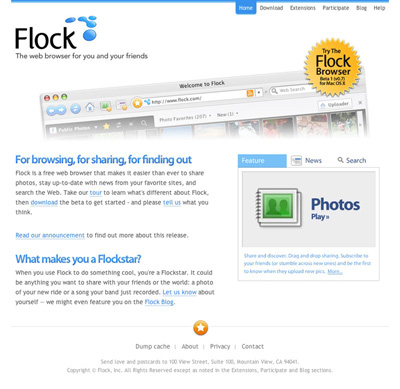
I, for one, have completely lost faith in the project. I was initially interested in seeing what kind of progress had been made with the browser, but now I just can’t bear to look at the thing.
Flock that!
An Update
After a lengthy conversation with Evan Hamilton, Flock’s Community Ambassador, I’ve made a discovery or two. It turns out that the new Flock design was actually contracted out to an external agency. Flock have since hired an in-house designer, who, according to Evan will be able to properly communicate their visual ambitions. Evan mentioned the difficulties that arise when contracting a design over a large geographical distance, and I fully understand.
I must say, I was very impressed with Evan’s response during our back-and-forth, he was wonderful to chat with, seemed to take notice of my criticism and suggestions, was not offended by this harsh article and just came across as genuine. Consider my faith in the Flock project restored.
Silktide‘s well known Sitescore version 2 has recently been exhibited as an invite-only beta.
The online tool is used to analyze and score websites from a host of different methods, and is an invaluable tool for examining usability and SEO status.
Along with a brand new and down-right sexy design facelift, the behind the scenes score generating process has undergone some major changes, and according to Silktide, will now be more accurate and balanced.
Unfortunately I haven’t had the chance to try it out, although I am thoroughly looking forward to it’s open release in the very near future.
Check it out at Sitescore.org
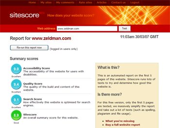
(Image courtesy of sitescore.org)