Fantastic Collection of WordPress Themes & Website Templates

WriteRoom – Simplicity Done Write

June 1st, 2007

I’ve never been one to shamelessly promote a specific product, but I found myself compelled to spread the word about a little productivity-boosting app called WriteRoom (excuse the horrific pun in this post’s title). Put simply, WriteRoom blocks you from all the flashing widgets, bouncing icons and pretty colours of the OS X interface and gives you a blank “typewriter-style” page, loyally waiting to take down your notes, or record your next blog post (such as I’m doing this very moment).

WriteRoom

It’s not just the application itself that I’m impressed with, but the whole concept of the application’s authors noticing a small problem, and solving it in a beautifully simplistic manner. One might say that WriteRoom provides you with the bare minimum of tools to facilitate your writing needs, but in doing this, you are not inclined to being distracted with formatting your document or playing around in contextual menu.

I have messed around with more writing applications than I can count on one hand, between Pages, MarsEdit, Colloquy and a few others, I felt unsatisfied. WriteRoom has truly solved *my* problem with external distraction, and I’m truly thankful.

Note: If you’re a Windows user looking for a text-editor in the same vain as WriteRoom, check out its win32 cousin Dark Room.

Web Design Books

May 30th, 2007

I’ve never really been one to enjoy reading, at least analogue texts, but I just couldn’t resist the temptation to add a couple of Design Books to my underpopulated bookshelf. A couple of days ago I received a nice little package from Amazon.com, enclosed was the classic usability bible Don’t Make Me Think by Steve Krug, and Bulletproof Web Design by Dan Cederholm.

Both books are useful, if not at least interesting in their own right, however I simply can’t help but feel dissatisfied after reading (glancing) through each. Perhaps its just that I’m a practical learner, I require visual and interactive stimulation in order to get the ‘ole brain sparked up. Or perhaps I simply don’t have the patience required to sit down and read the things. Don’t get me wrong, I don’t have any issues with scholarship, I have do have a thirst for knowledge, but I doubt that traditional books will ever be able to quench this.

Trial and error, self teaching and internet browsing has taught me everything I know about the art and practice of Web Design… much more than studying any long-winded text ever could. I just don’t know…

6 Designer Job Boards

May 20th, 2007

Whoever said it was tough to find Web Design jobs? I’ve rounded up a list of 6 of the best online Job Boards for Web Design and other Digital Creative positions, freelance or permanent. Using this list (assuming you are skilled enough at your craft) you should have no excuse not to get out there and secure your next job!

Freelance Jobs – FreelanceSwitch

FreelanceSwitch has a wonderful Job Board, focused on Freelance positions.

Krop

Krop offers a great to-the-point list of “Creative & Tech Jobs”.

Jobs & Gigs

Jobs & Gigs uses the clever idea of separating “Jobs” (permanent employment) and “Gigs” (contract-based work) in a well-designed list.

Authentic Jobs

Cameron Moll brings you Authentic Jobs, a Design and Development Job Board that also features a great Dashboard Widget, and advertises positions for some high profile companies.

Coroflot

Corofloat‘s Job Board is very frequently updated and extensive.

Sitepoint “Looking to Hire”

If you’re getting really desperate, and don’t mind having the chance of doing underpaid amateur work, check out Sitepoint Looking to Hire

Planning for Design

May 12th, 2007

Traditionally, “Design”, including that of the Web variety has been taught in Schools and Universities as a strict and specific progress involving stages boiling down to (typically) 1: Planning – 2: Development – 3: Delivery, but is this really the most efficient way to work? Design is such a subjective field, but do the gung-ho tactics of many designers yeild the same results as those of designers who spend their time working in “pre-design”, carefully planning their next moves?

Let’s hear it from the pros

In preparation for this article, I have been attempting to contact some of the more well-known icons of the Web Design community, in order to find out exactly how they conduct things. The responses I received were quite varied, and a couple were pretty surprising.

So actually, I’m one of those guys that don’t do much paper sketches. Especially when it comes to UI design.
Wolfgang Bartelme

Unfortunately I don’t know if I kept any of the drafts on designs I’ve completed.
Christian Montoya

I do believe using paper is incredibly important, and I’m actually about to write up a post about some of my ideas that I’ve been using. I’m actually at the point where paper rivals the amount of design work I do with my computer. In fact, at this point, I might say that paper has over-taken my computer as my primary design tool of choice.
I’ll generally spend hours exploring and fleshing out ideas before I do anything at all on the computer. Then, depending on the project and my responsibilities for that project, I’ll turn the paper version into either wireframes, a comp, or even working code.I’ve found the use of paper to be a far superior way to come up with solutions. It’s much less focused on constraints and allows me to be significantly more creative.
Garrett Dimon

Unfortunately, I’m not a sketcher. I sometimes do little doodles when coming up with ideas for logos but I tend to play in Fireworks more than hand draw.
Jonathan Snook

And the community response?

I also made a few posts on a couple of Web Design-related forums, namely Mint Pages and my.9rules notes, the replies were not in vast quantity, but at least the responses can be used as a probe into the Design community’s general consensus.

Sometimes I get a design instantly, or just open photoshop to “doodle” and *bam* it’s there. Other times, it takes a couple of weeks to brew (if I have the time) in my mind, then countless tiny sketches and perhaps a couple of large (a4-filling) sketches or worked-out drawings, and then I bring it to photoshop. I do both ways varying on the time and place.
— Kilian

I actually don’t like to sketch, it distracts me. I tend to zone out and let the idea process “sketch it out” in my head.
My Design teachers HATED this and tried to dock me points on projects for lack of “brainstorming” but the dean wouldn’t let them as my end results were on par or better than those who HAD sketched.
— RightOn

I’m a real hands-on/visual person, so seeing things befone-hand is important to me, however, I often have a hard time putting my ideas on paper. So I’ll often start sketching out (sometimes just outlining) the project/idea, then finish I’ll it off in my head.
Though, add in the fact that I’m horribly forgetful, and then you can have quite a mess…so even though it can be a hassle for me to write stuff down and sketch it all out beforehand, I usually find that my projects turn out much better once I’ve brought them down to earth enough to have them written out on paper.
— momentography

The word “design” says it all. You’re not a designer unless you create a project and follow the steps necessary to render it properly. I usually go through a stabilished set of steps – sketch, test, render, test, deliver.
— FernandoLins

Apparently I am the oddball…I don’t sketch anything…I head straight for Photoshop to begin my mockups.
I, unfortunately, have very little talent for drawing, so sketching isn’t much help unless I am away from a computer and trying to describe the design to someone. I am not saying I have NEVER sketched, just that it isn’t in my standard process.
— creativeUI

Is the design process dead?

I was absolutely shocked to find out that most of the “top” Designers I queried revealed that they did very little to no on-paper planning before jumping into a design. I might add that I myself have been a proponent for “gung-ho” design tactics, and frequently work of bursts of inspiration rather than carefully planned work but I always assumed that this method was frowned upon among the community, I thought that I would be better off with sticking to the tried and tested generic design process… perhaps I was mistaken?

Each to his own

The answer to the question of “which is better?” is anything but clear-cut, and I can only respond by pointing out that everybody eventually discovers what “works” for them, people, by nature, simply think in different ways, some (mainly those who are more creatively-inclined) are motivated by their inspiration, others (primarily the more academically-minded) rely on a structured and careful approach, and you know what… as long as the client (or the Designer themselves) is happy, we need not worry ourselves about the process itself.

I can only wish that the results of this article were a little more definitive, but in an industry as subjective as the one we work in, no methods can truly be labeled as optimal. I recommend trying your hand at working from each approach in turn, and you will soon discover which one you are more comfortable with. Even if you have been a life-time subscriber to one school of thought, only good things can come from investigating other means of production.

Sharpfolio: WordPress Portfolio Theme

May 10th, 2007

THEME UPDATED OCTOBER 14, 2009
Updated to conform with the latest version (2.8.4) . Also theme provides a 4-page install and configuration document.

About

Sharpfolio is a WordPress theme designed to enable Web Designers, Graphic Designers, Photographers, Motion Designers, Artists or any creative professional to showcase their work in a simple, clean, beautiful portfolio. Sharpfolio aims to focus primarily on your work, because after all, this is what’s most important.

Preview

Live Demo

So if you’re not totally convinced yet, have a look at the Live Demo.

Download

Download Sharpfolio

Setup Instructions

After installing Sharpfolio (WordPress 2.5+ is highly recommended), you must go to the Settings page of your WordPress Dashboard, then the Miscellaneous panel. Set the Medium Size to 500px wide and 800px high. This will ensure that the images you post appear nicely in your portfolio. Install and configuration instructions included in download.

How to post in Sharpfolio

It’s a little different to posting in a normal blog. I seriously recommend reading these instructions on how to post projects in your portfolio.

License

This work is licensed under a Creative Commons Attribution-Noncommercial 3.0 License. If you like my work, then tell your friends!

Bugs and Suggestions

If you have any issues with the theme, have found a bug or want to abuse me about something, scoot over to the contact page and drop me a line.

Support Future Development

Sharpfolio is released and developed free of charge, but it still takes time and money. If you find it useful, please be courteous and leave the link to the theme intact.

Stay tuned for updates

Sharpfolio is released and developed free of charge and will be continually improved and updated, so make sure to subscribe to the RSS Feed to stay up to date.

The Web 2.0 Cliche

May 8th, 2007

The past two or three hours of my life have been spent at my desk, researching and discovering more information about the perpetuation of the “Web 2.0” design trend. Most of this time has been spent with my jaw dropped, and my eyes transfixed. Some of the absolute clueless and incomprehensible visual drivel that is perpetuated by “designers” who seem more akin to 12-year-old trendwhores than actual professionals (and you know, they probably are) is utterly flabbergasting. But before I go off on a senseless rant, let’s try and make this article a little more structured 🙂

What is Web 2.0?

Starting right back on page one, we must first cast our minds back to the year 2004, when the term “Web 2.0” emerged. So, what exactly is Web 2.0?
Now, there’s one question that has (over time) become needlessly difficult to answer, however the original definition should still ring true. The term “Web 2.0” was coined by Tim O’Reilly, and has in recent times, unfortunately drifted into the realms of been closely associated with superfluous trends and pointless buzzwords.

“Web 2.0 is the business revolution in the computer industry caused by the move to the internet as platform, and an attempt to understand the rules for success on that new platform.”
Tim O’Reilly

Now, perhaps I’ve completely lost the plot here, but how does this have anything whatsoever to do with pointless design trends? Sure, we must start thinking about new and more efficient methods of human-computer interaction, but I think somewhere along the line a miscommunication has occurred. It’s quotes such as the following that are deeply troubling;

Nowadays Web 2.0 style becomes more popular. Every day tons of sites which has simple, bright and very interesting things, appear in Network. There are no standards about creating any Web 2.0 elements, but we have several typical features, for example and clean colors, many gradients.
IRIS Design

Perhaps what should be taken from the above quote is that Web 2.0 is about poor spelling, terrible grammar and improper punctuation.

Community Perception

So, we have established what exactly the term “Web 2.0” is supposed to mean, but how did this term become so colloquial, while deteriorating into a vague simile? We have seen many sites that may be perceived as emitting a “Web 2.0” image, such as Digg and Flickr, and these only furthered to promote a narrow-minded outsider perception of “Web 2.0”.

A Personal View

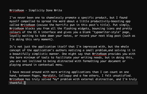
To me, “Web 2.0” simply defines a natural shift in the way we should think of the web. It stands for the introduction of new technologies, asynchronous and cross-site data access and a community-centric focus. In lamen’s terms, I believe Web 2.0 (among other things) is a vehicle for offering digestible content, and harnessing the mob mentality. I will do my best not to refer to “Web 2.0 Design” in the following passages, as I feel “Web 2.0” and Design (while in many cases working hand-in-hand) simply should not be associated with such a tight dependance. My preferred term is “Contemporary Web Design”.

There are many aspects of “Web 1.0” that I truly will not miss (namely splash pages, popups, background music and flash animated navigation), however it is still upsetting to see the vast number of “designers” who find it necessary to answer to trends and perpetuate the existence of pointless, ill thought out and trendy design.

My Angry-list

The following are things that irritate me in the highest order, feel free to alert me of other 2.0-annoyances.

  • The number (and baffling popularity) of “Web 2.0 Design Tutorials” found on Digg.com
  • The labeling of any trendily-designed site as “Web 2.0” – and on the same token:
  • The instant condemning of “Contemporary Design” by Web 2.0 haters
  • The corporations who jump the shark and throw their money at useless projects
  • The exploitation and piggy-backing of already-popular startups
  • The exploitation of trends for “blind” traffic
  • The dropping of letters from domain names. Flickr did it first, and now it’s been done to death

More horrific quotes

And now, as a kind of sign-off, for your personal enjoyment; a couple more completely misguided minds will enlighten you with their thoughts on the “Web 2.0 Style”. Lifted from blogs and subsequent user comments.

I love web 2.0, and I don’t wanna be a jerk… but I’d like to point out that the web 2.0 style is very closely related (in fact, almost a copy of) apple’s “Aqua” interface style.
Ungus

In order to sell to Yahoo!, Google or even get a mention on TechCrunch, you’ve got to have a web based app that’s the next big thing – add a heavy serving of AJAX, maybe use Ruby on Rails, or one of the squillion new code frameworks that have popped up in recent times, maybe have some form of tagging on the site, improve your usability over and over until even your grandmother can use it, and then…
Miles

Final thoughts

If you take anything from this article, anything at all, I hope it would be to attempt to help in the phasing out of the term “Web 2.0”. It’s time we as an online society move onwards and upwards, and instead of wasting our time trying to jump on the bandwagon of fledgling fads, we should focus on innovating, and making the next technological leaps towards the future. The true meaning and philosophy that was once held by this term has now degenerated to a meaningless cliche, it’s time to move on.

Anybody Want a Joost Invite?

May 7th, 2007

I’ve been using Joost for a little while now and am convinced that it’s definitely going to be a big part of the future of internet TV.

Joost™ the best of tv and the internet

Make a comment on this post with your email, and I’ll send you an Invite.

**UPDATE**  – Invite closed.

Clothing by/for Designers

May 6th, 2007

There are many great clothing sites out there, but a couple really stand out for me; Funkrush and Threadless. The prototypical customer for each site would probably be a designer themselves, and would appreciate some of the wonderful illustrative works featured on these t-shirts.

Threadless
Funkrush

Threadless – A ‘Web2’ approach

Threadless has really built up an entire community around t-shirt designs. Any designer who thinks they’re worthy can make an account and start submitting their works, and the designs that make the cut are chosen by the community. Designs must receive a certain rating from the community before they’re printed. This process seems to work well, and it’s obvious that a lot of thought has gone into making Threadless as community-driven as possible.

Funkrush Quality

Funkrush takes a different approach to design. Their workforce mainly consists of well-known and respected illustrators from online communities. This ensures that only great quality designs are churned out, and seems to work great!

I’d advise everyone to at least check out these two great sites, who knows, maybe you’ll fall in love with their apparel as much as I have 🙂

Funkrush T-Shirt

Images courtesy Funkrush.com and Threadless.com

A Rant About Application GUIs

May 5th, 2007

I was recently browsing through the my.9rules notes, and I stumbled across a post penned by a ‘ruler who was irritated by applications that have their own non-standard GUI (think Windows Live Messenger). I realized that it was something that has been irritating me for so long.

If you”re not quite sure what I”m on about, here are a couple of screenshots of the worst (Windows) perpetrators. From top to bottom: Xfire, Steam, Windows Live Messenger (previously MSN Messenger), Ad-Aware and AIM Triton.

Xfire
Steam
Messenger
Ad-Aware
AIM

I hate having my OS”s GUI broken up by non-standard graphical layouts. Since when was the standard GUI inadequate even for Microsoft”s own applications?! Speaking of counter-usibility, Windows Live Messenger would have to be one of the most un-accessible applications I”ve ever had the misfortune to use, and now that MS has slowly phased in a “Vista” aesthetic, it sticks out like a sore (and ugly) thumb on my XP Desktop. I”m definitely in no hurry to upgrade to Vista, I had a short experience with it, but uninstalled it within a week due to it”s incompatibilities, terrible look and a slew of other issues. I”m just glad I have my trusty Mac here to serve as my main computer, and I”m thankful that I don”t have to use XP/Windows on a daily basis.

Left Behind?

May 4th, 2007

I’ll be the first to admit it, I just find Twitter irritating. There’s just something in me that doesn’t make me interested in hearing the mundane information about people’s lives. Especially when it’s fired at you at the rate of “Tweets”. Sure, it’s a fine concept, and it’s obviously caught on with some degree of success, but I’m simply not interested in that sort of thing.

I must confess, I did make a Twitter account, just to try the thing out. It lasted for all of 10 minutes. I just don’t know if any good things can come from a community which is centered around “ping” type updates, of little value.

And speaking of the “new wave” community sites, Virb is not my cup of tea either. I’m already a part of Myspace (just for my “real life” friends. I do have some :)), many forums, Digg, YouTube and actively comment on as many blogs as I can, and I think that’s just about enough. These days there are just so many social networks and groups to be a part of, and Virb (to me) is just one too many.

When I begin to think more deeply about it, I struggle to find any advantageous purpose for these social-networky sites. Sure, it’s great to have connections, but between LinkedIn, Myspace, Virb and Twitter (just to name a few of the more popular ones), we are really overly spoiled for choice. One minute you just *have* to be a part of Myspace, then weeks later, your friends are asking you to join Virb, what’s next? Each new network seems to be “Newer, Cooler and Better!”. There really should be one, single, definitive network that connects everyone in a balanced and generic way. Not thousands of sub-par networks which are populated and deserted on a whim. Fads come and go way too quickly, so the internet may not be the place for making meaningful and lifetime connections.

Call me old fashioned, but I’ll stick to my real life social networks. Even if I don’t have 5,212 friends.

River of News? More Like a Tsunami!

May 4th, 2007

I currently subscribe to 306 RSS feeds from around the web (That’s after cutting out all the pointless design galleries I used to syndicate). My morning ritual begins with checking the “tsunami of news” that I’m drenched in, over a cup of coffee. It usually ends up consuming an hour of my morning, there’s usually 50-150 stories to check over, and I don’t like to skip over any without first glancing at the story’s content.

If I’m ever to neglect my daily ritual, the stories simply keep piling up, and I end up having a few hours of reading ahead of me, which for some reason I won’t let myself skip.

I’d love to have this practice consume less of my time, but I just can’t bear to see any of my feeds go, lest I miss that one important gem of a story. I’m sure I’m not alone with my tribulations, and I’m sure that there are many out there in internet-land who subscribe to many more feeds than me.

River of News

Mint Vs Reinvigorate – Battle of the Stats

May 3rd, 2007

I’ve been an avid user of Shaun Inman’s Mint since a little while after it’s initial public release, and have been altogether pleased with it’s stat-tracking abilities and clean aesthetic.

reinvigorate map
reinvigorate

But there’s a new kid on the block, and it’s been seducing me with an almost similar minty-green flair ever since I realized I still had a beta invite lying around. It’s called reinvigorate.

Being a hosted stats package, reinvigorate works in a slightly different manner to Mint, your stats are calculated and displayed on a remote server, which provides a great looking page filled with pretty pie charts, bar graphs and all the raw data to fuel blogger’s egomania. reinvigorate is currently free of charge, and with Mint priced at $30 per license, this may be it’s biggest advantage.

There’s no denying that both packages offer a beautiful interface, and both will be more than adequate for the average user’s needs, but my preference still lies with Mint. It’s level of customizability, plugin architecture and the fact that it’s hosted on my own server make it the most useful statistics package to date.

That said, I do prefer reinvigorate’s design to Mint’s, I just love the beautiful graphs and charts it renders, as well as the cool tabbed interface.

New Monitor

April 30th, 2007

Today I unpacked my brand spankin’ new Dell 2407WFP Monitor, and I’m absolutely smitten with it. Moving from my relatively tiny 1440×900 MacBook Pro screen to this 16:10 widescreen beauty was a big step, but I now can’t figure out how I survived without it. Designing is so much easier when you have enough screen real estate to work with, and it makes multitasking so much smoother and more enjoyable.

Now I just need to upgrade my RAM to at least 1GB. With all these applications running, my poor old M-Book is getting a little hot under the collar!

Kevin Smith’s SModcast

April 27th, 2007

I love Kevin Smith. If you love Kevin Smith too, check out his podcast, called Kevin Smith’s SModcast. Each episode usually ends up as 50 minutes of mindless rambling about non-important issues, but it’s still hilarious, and easy to listen to while working.

And Here Come the CS3 Icon Replacements

April 23rd, 2007

With Adobe’s new Creative Suite 3 icons receiving a less-than-warm reception in the blogosphere, a couple of designers have taken on the task of bringing them a different look. At the moment I’ve come across three great sets of icons to replace the basic CS3 ones, but there’s definitely more to come.

Check out Koregraphic, Louie Mantia and Adam Betts’ wonderful replacement sets.

Louie Mantia CS3 Icons
Koregraphic CS3 Icons

Inspiring Motion Graphics

April 21st, 2007

In lieu of my recent post on Curing Designer’s Block, I thought I would share something that has been a wonderful source of inspiration for quite some time. An oft-neglected form of design that is (from personal experience) much more involved and difficult to master than any other field of design. Motion Graphics

Two-dimensional static design (such as that on the web or in print) is in itself a skill which requires much calculated thought, careful planning and a little bit of natural ability to truly master. Now, just think of the Motion Designers out there, who not only have to work with two and in many cases three dimensions, they also have to bring this design to life in a fourth dimension; time.

Some of the greats from this industry churn out beautiful works of art, that are truly captivating and generally inspiring in all walks of design. I have featured some of my favorite demo reels and clips below. I suggest that all designers look more into this industry, as it’s just a visually enthralling experience to witness some of the greater works.

Blur

Blur

exopolis

exopolis

Hue

Hue

National Television

National Television

Pauloblob

Pauloblob

Ságas

Sagas

GUNSHOP

Gunshop

If you’re looking to find out more information on Motion Graphic Design, or just crave more cool clips, I suggest checking out the great Motion Graphics blog, Motionographer or xplsv.tv.

Curing Designers Block

April 16th, 2007

When designing for the Web, or for any environment for that matter, every designer gets stuck at one point or another. Many people simply scrap their progress and start from the beginning, but is this the best practice? Here are a few tips that have helped me get through some creative dry patches.

Sleep on it

One of the best things one can do to bring a fresh view to their stale design, is to sleep on it. Get a good nights sleep (a nap may also help), forget about your design woes and come back the next day to your work. This is probably the most effective means of rebuilding your inspiration.

Take a walk

Walking is a great way to clear your mind, and we could all use a little more exercise too 🙂 If you don’t like walking, then just get out of the house, go and get a coffee, take a stroll through the mall. Just get away from your computer.

Take a shower

If you’re on a tight deadline, then Designers block can be a serious issue. And it’s effects are compounded with the stress and pressures of meeting your oncoming deadline. Taking a nice hot shower will cleanse your mind (and your body for that matter), and help you to relax. This has been a great help for me in some cases.

Do something else

Go and watch a movie, read the newspaper, hit up your Xbox 360, whatever you enjoy doing. These things are great helps in getting your mind under control, as long as you don’t get carried away and spend all day on them!

If you do ever run into Designers block, then be sure not simply scrap your work. Once you look upon your progress with fresh eyes and a clear mind, then your inspiration should come flooding back.

Why You Should Display “Time Ago” On Blog Posts

April 15th, 2007

I’m a huge advocate of displaying the “Time since this was posted” for your blogs posts. On the internet, our blog audience varies from people halfway across town to strangers from halfway across the planet, all of which live by differing timezones.

Displaying the time since each blog post was made can enforce to your readers that you maintain an active blog, and provides a simple way of letting visitors know how “fresh” each post is. And with the United States using a different date format to the rest of the world, keeping track of this becomes less trivial than it should be. Plus, reading “This post was made 2 hours and 5 minutes ago” is so much more “human friendly” than “Posted 02/12/2007 at 06:30 PM”

Standard date formats are just so 1995.

If you’re running WordPress, there’s a great (in terms of, it does it’s task simply and surely) plugin called Time Since (published and popularized by the well-known Binary Bonsai, that does the trick for me. It simple terms, it subtracts the post’s date/time from the current server date/time, and outputs it in a human-readable format.

Getting to Know WebKit

April 9th, 2007

I’ve recently stumbled upon a great post by Paul Stamatiou, which reinforced my love for Safari/WebKit. Check out Getting to know WebKit.

Why I Dropped Firefox for Safari

April 8th, 2007

Why Safari over Firefox?

I have always been a devout fan of Firefox, and it has many excellent features that make it a wonderful browser, and I love supporting open source projects, however, recently I begun to fall back on Safari as my browser of choice for daily browsing. There are a number of reasons why I did this, and I will do my best to explain myself in the following paragraphs.

Reason 1: Fonts

Firefox’s font rendering and anti-aliasing capabilities are far surpassed by that of Safari.app, I am not sure as to the reason why this is, but Firefox seems to not render fonts in the same way that the OS X GUI does, and thus the overall smoothness of type in Firefox is clearly sub par when comparing with the native OS X look. The crisp and smooth look of OS X’s font rendering was a major reason that I switched from Windows to Mac, and Firefox detracts from this experience.

Reason 2: Search Bar

This may seem like a minor thing to many people, but I can’t stand not having the little “x” in the search box in the top right of Firefox (clearing the input from the box). It takes way too much time to use the keyboard to delete the text in there after a search has been completed. On top of this, Safari also automatically clears it for you when a new tab is opened. Allowing you to quickly fire off another Google search, without hassle

Reason 3: Forms

Many people have attacked Safari for being quite restrictive when it comes to styling forms within web pages, form elements cannot be styled with CSS like any other standard page element, they are fixed to the “OS X” style. Many people find this irritating, however I quite like the look, especially when compared to Firefox’s “Windows Default Gray” feel.

Reason 4: Speed

When I was using Firefox as my everyday browser, I had it loaded with 5 or 6 different extensions, which began to seriously impact the browsers performance. Memory leaks were frequent, and the thing was just generally slow.

Reason 5: Aesthetics

To me (I’m running Uno to eliminate the tacky “brushed metal”) Safari just looks better. No unnecessary buttons, clear and clean design.

Reason 6: Download Icons

One really neat “feature” of Safari is that when you download a file, it’s icon actually has an updating progress bar on it. This means when you download multiple files simultaneously, you can easily track their progress simply by glancing at the desktop. This simply removes the necessity for a “downloads” window that only adds to screen clutter.

All that said, there are a few things that Firefox can do that Safari just can’t, and I still use Firefox and it’s wonderful Firebug and Web Developer plugins to test and debug websites. A flexible plugin engine would be really cool for Safari, however I don’t see this happening in the near future.

If any of you think I’m out of my mind for not using Firefox, or can suggest any ways to improve my Firefox experience, let me know.

Free Themes

Web Services Template

This is a beautiful and clean Web Services / Business Template.

Photography Template

This is a beautiful and clean photography template.

Hosting Business Template

This is a beautiful and clean Hosting/Business Template that can be used for companies who offer design related products or services to their customers.

Business Web Template

This is a beautiful and clean Business Template that can be used for companies who offer design related products or services to their customers.

Green Design Template

This is a beautiful and clean Green Design Company Template that can be used for companies who offer design related products or services to their customers.

Auto Website Template

This is a beautiful and clean Auto Website Template that can be used for companies who offer design related products or services to their customers.

Revolutionary WordPress Theme

Clean and easy on eyes Wordpress theme, well structured, top quality coded with optional ad spots, fully widgetized and ready to go!!!

LightCSS WordPress Theme

Clean and easy on eyes theme, well structured, top quality coded with featured posts, ads spots, fully widgetized and ready to go!!!

ColdBlue Blogger Template

For those of you who love the simplicity of our popular ColdBlue Wordpress theme, but use Blogger as your blogging platform…you can now rejoice! The theme is now available!

Curious WordPress Theme

Curious is released and developed free of charge and will be continually improved and updated.

SandDollar WordPress Theme

SandDollar is released and developed free of charge and will be continually improved and updated...

ColdBlue WordPress Theme

ColdBlue is a WordPress Theme created to be aesthetically pleasing, open, minimalistic and easy to use.

Sharpfolio: WordPress Portfolio Theme

Sharpfolio is a WordPress theme designed to enable Web Designers, Graphic Designers, Photographers, Motion Designers, Artists or any creative professional....